| |

Art Team
|
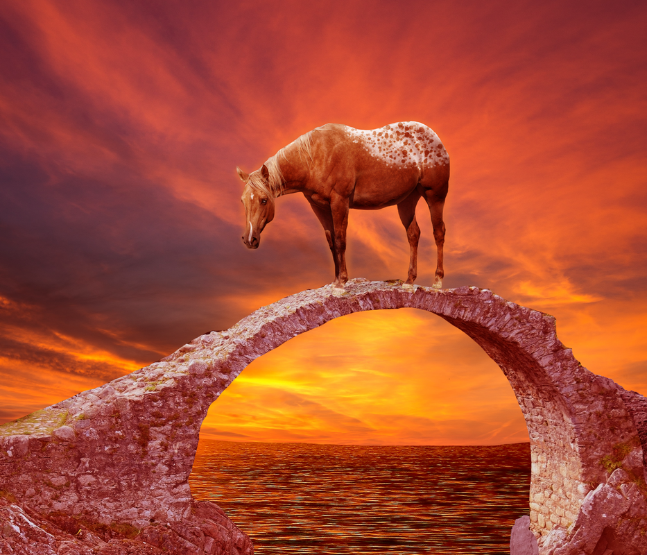
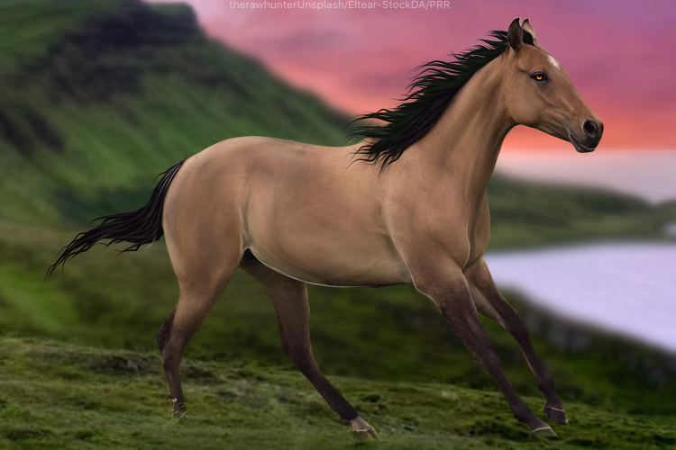
@Breezie I like this piece lot! Horse fits very nice in the setting except for the lighting. I personally feel that the shadows are too sharp based on the fact that there isn't an obvious light source. Beautiful eye. . @Ladybird Beautiful mane, gorgeous markings, great muscling. I'm iffy on the lighting, particularly on the fabric. The wings don't really have any highlights and the highlight on the horn is too strong. |
|  |
|
| |

|
 How could I make this better? |
|  |
|
| |
Art Team
|
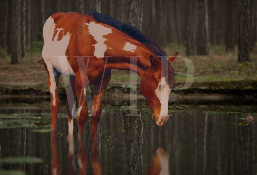
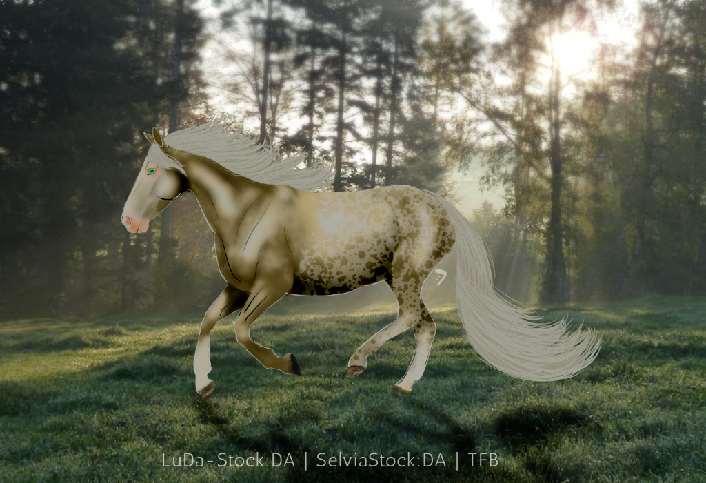
I feel like I'm just the lighting critic, lol. Maybe you should change my officer role 😂 . @TFB I really like the pattern in this piece. In my opinion, there are two main point ms of improvement; lighting and hair. Hair; In the mane and forelock, the flow is really nice. The tail, the flow is not flowing. It's like there is two different flows where the top one should flow nicely into the other rather than the second flow coming across at an angle. (Please let me know if that doesn't make any sense, lol) In both the mane and tail, use more shades of the base coat. Currently, I can easily pick out two shades. Give me at least two more 😜Also, use a smaller brush as the shades get lighter. Lighting; ask yourself, "Where is the light coming from in this image?" The answer is the top right corner. Your horse doesn't really have any highlights from the light source when, realistically, the top line should be significantly lighter than the bottom of the stomach. (Not sure if this would fall under lighting, hair, or both, but the mane should cast a shadow on the horse as well) Final piece of lighting; the horse's shadow. A horse's shadow will almost never be in the exact same place between two different images so you can't assume it will just be on one side of the horse at a vertical angle when in reality, the horse's shadow in this image should be slanted diagonally to the left when looking at the light source. Final reccomendation, the rear hoof closest to the viewer. You may have to draw some hoof in because right now it looks mildly deformed. Keep up the great work! |
| |
|
| |
Art Team
|
Didn't quite realize how long that was.... 😂 |
| |
|
| |

|
|
| |

|
A WIP piece for a contest entry, I'm a bit puzzled on what else I should add as I feel like the right side is missing something. Help and critique so far please. :) |
|
|
| |

|
Cliffyard Stables said:
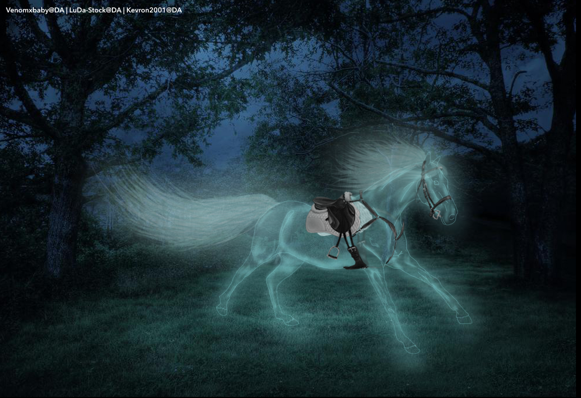
Could I get some pointers on this piece? It just looks a little off to me. I tried doing a ghost horse, have never made one before.
Still needing some help with this! |
|
|
| |

|
I find it a little strange that the ghost horse has totally normal tack. Maybe if the tack was also ghostly it would look more like it actually belongs to the horse. Also the grounding of the horse needs some work. The hooves should be covered by the grass and the ground under the horse should have a glow, the reflection of the glow of the horse. I think that is all, in rest it's really pretty :)
Cliffyard Stables said:
Cliffyard Stables said:
Could I get some pointers on this piece? It just looks a little off to me. I tried doing a ghost horse, have never made one before.
Still needing some help with this!
|
|  |
|
| |

|
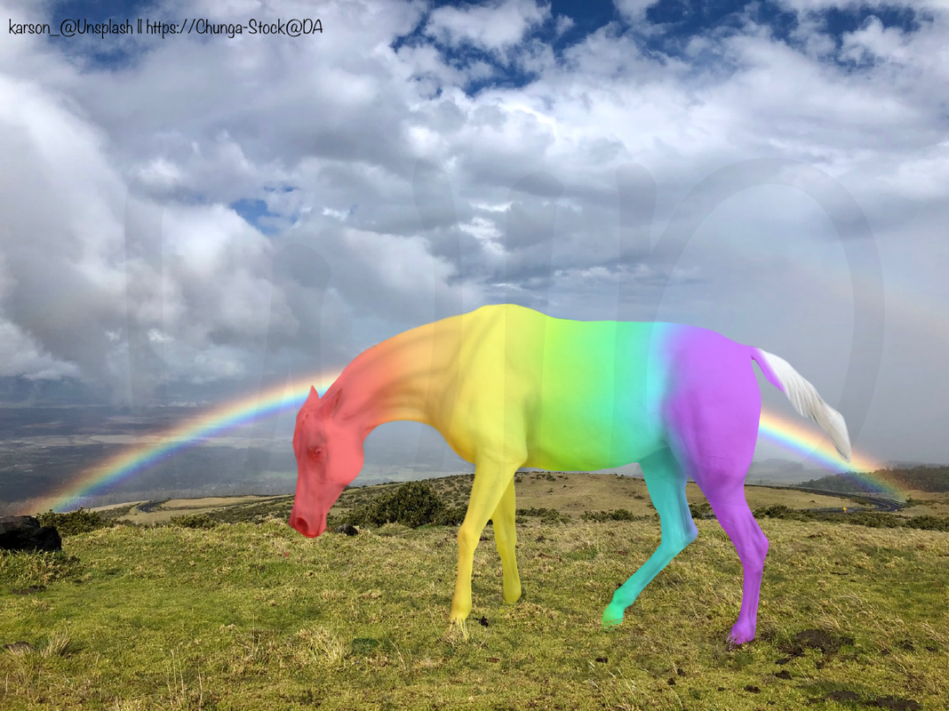
I would love some help on where the lighting should be. It’s for an art contest that end in 2 days lol |
|
|
| |
|
Edited at July 17, 2020 01:18 PM by Phoenix Rising Ranch
|
|
|
 Morning Frost and Afternoon Sunshine