| |

|
I would also like to add that I'm completely lost on where to go next to make this piece better and stand out more. so if anyone has any links to videos or tutorials that'd be greatly appreciated as well :) |
|  |
|
| |

|
Barkers Run said:
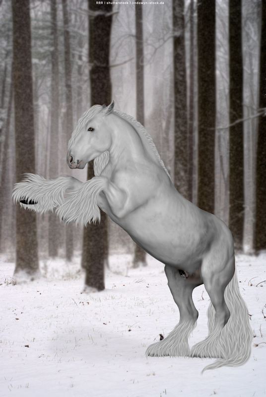
Im on the fence with this piece.
very blury, mane and tail are not the greatest either, I also love the rearing horse and feel ive gotten him to match the background quiet well, but the lighting just isnt right?or the exact position of the horse.. I know it needs improvment so please help me XD
Its actually quite pretty. I think what's really throwing the image here is the size of the horse. If you could shrink him down a bit, it'd help tons. Because currently, he looks like he is the same size as the stone. I'm not sure if that was intended but either way, it helps to create contrast when you have different objects that are different sizes which in turn helps the image look more pleasing to the eyeball. I actually think your lighting is pretty spot on but I'm no lighting expert by far. It would also help if you enhanced the eyeball of your horse by taking lighter blue (or lighter color of the darker color) and lightly paint an eye, but be sure it is crisp as you have blurred the horses face to much already. Next horse, blurr way less than what you think you need. Especially if you are recoloring or adding marking in that particular area. Work on grounding, it's not terrible but (and especially when the horse is smaller) good grounding can add an enormous feeling of detail. For the shortness of this grass/footing on your particular image, a couple of short zigzags/blades would be needed. .. Hope this helps! In case your wondering, I'm an player whose been on the site for several RL years and I used to do photomanips and currently I play around on some digital paintings. Oh geezer though, I haven't been on this forum thread for a hot minute though! Ok, I'll stop talking before I sound even more like an old lady (I'm not) 😂😂 |
|  |
|
| |
|
Barkers Run said:
I would also like to add that I'm completely lost on where to go next to make this piece better and stand out more. so if anyone has any links to videos or tutorials that'd be greatly appreciated as well :)
It's not so much your technique as it is (or seems to be) your inexperience and your own playing around with stuff. Just make lots and lots of premades with completely different settings to challenge your self and you'll be set. Also, not sure if I'll ever be able to find it, but I found an amazing tutorial for eyes on dA. It was made by a Vixen Studios if im right but that was so long ago...... |
| |
|
| |
|
@Yellowtail Ranch thank you so much This is what i've managed, I'm planning on doing another one tonight or tomorrow so will try and find better quality images and take that all on board. I have been watching Vixen studios on youtube and theyre great! I used her method in this piece The eyes in this one are unforntuanlty to far gone haha. and I'll admit i've been playing for 6 years and doing pretty much the same haha, I do photography and this is just for fun, I enjoy creating it but dont have great taste nor the skill to perfectly match a horse to the background, but all comes with practice and time :) thank you again for your input. |
| |
|
| |

|
I know, I messed up on the reflection and didn't notice until after it was all finished X3 -Click for Details- (It's kind of a big file lol) |
|
|
| |

|
Edited at May 29, 2021 11:39 AM by Diagon Alley Elites
|
|
|
| |

|
I tried out some new techniques with this piece (including my second time with floofy feet) and I'd love some opinions! |
|  |
|
| |

|
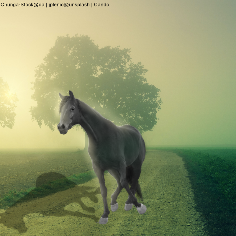
Diagon Alley Elites said:
Thoughts on this? Specifically, I need help getting the horse to fit the background Im really struggling with that. But just overall critique
ElenaDudina's stock isn't allowed on HEE.
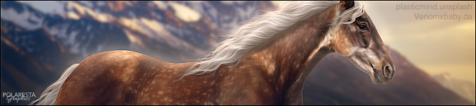
Red River Ranch said:
I tried out some new techniques with this piece (including my second time with floofy feet) and I'd love some opinions!
The body prep is stunning! The horse fits the background well. The only things I would fix are: 1. Clean up the edges a bit, it still looks fuzzy in spots. 2. Add a bit more of a shadow at the base. It's all the same shade, when it should be darker nearer where the horse is touching the ground. 3. You need to work on your hair. It still looks unnatural. I love how you did it, but try to make the strands of hair a bit fuzzier on the edges, let them blend together a bit more. Each hair looks very sharp right now and that makes the hair look unnatural and overlarge. |
|
|
| |
|
I need help! XD Tear it apart please! |
|
|
| |
|
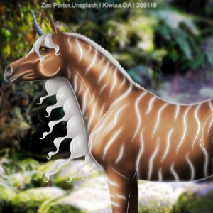
Feel somethings off, please pick it apart LOL - CC, I feel like the horse is so far back, yet so far forward. So it kinda makes the horse appear stretched out. But dont have much time lol, but thats really all i could see wrong! |
|
|
 Crisp, Clear, and Cool