| |

|
Purple Pegasus Farm said:
Apprehensive about posting this here because I think I probably could've done better. But I feel like I've hit a wall here and would like some pointers.
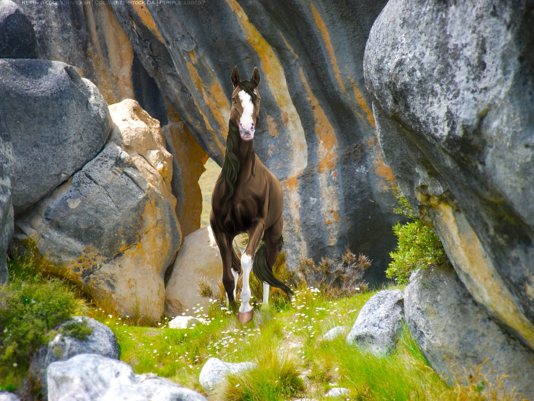
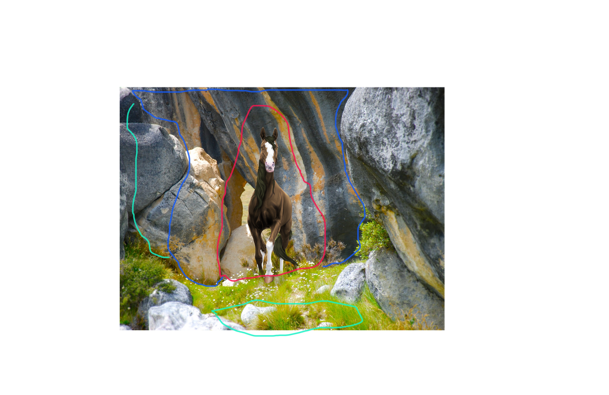
I LOVE the body prep you've done here!! The eyes and mane, beautiful! Great job! I especially like how shiny the hoof is :D The only thing I would do differently here is blur the bg directly behind the horse and a bit to the left What /I/ would do (please feel free to do as you like): Red - blur the most, I use the PS gaussian blur filter at like 2-3 Blue - blur less, I do 1-1.5 Teal - hardly blur, At this point, I use the blur tool at 35(ish) strength and play around until It looks right. This should bring more attention to the horse and bring the piece together nicely I hope this helps! Poke me if you have any questions :D |
|  |
|
| |

Art Team
|
Im looking for some guidance with this tail, I'm really struggling! Any sort of pointers would help also! Be cruel 🥺  |
|  |
|
| |

|
It's gorgeous, Zomb, but maybe add some more definition to the strands of the mane? It looks flat and all one color at the moment. |
|
|
| |
Art Team
|
Cherry River Elites said:
It's gorgeous, Zomb, but maybe add some more definition to the strands of the mane? It looks flat and all one color at the moment.
Ah yes at that time it wasn't finished. This is it finished now  well the horse Avi cut |
| |
|
| |
|
Yes that looks a lot better <3 |
|
|
| |
|
I would do something like this https://i.pinimg.com/originals/24/ec/08/24ec082d8196c3e0590f509ca873d867.jpg |
|
|
| |

Art Team
|
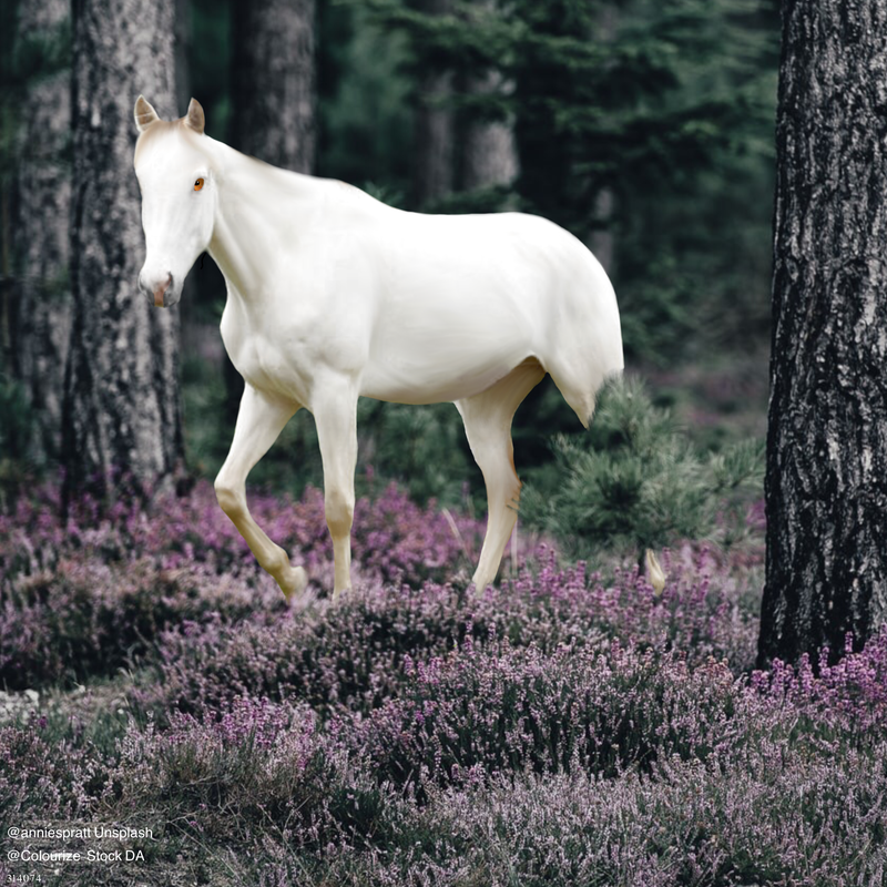
Finally getting back into this XD First off, would love any help you can provide about drawing fire. I'm pretty happy with this but I know there is always room to improve. . @Night Shadow Stables Looking at the kind of spooky black horse in the forest: I genuinely really like this piece. It's very smooth, clean, and aesthetically pleasing. The colors work well together as does the perspective. The first thing I would recommend taking a look at is the eyes. Front on eyes are the absolute hardest. The tricky part is making is look like the horse isn't looking in two directions at the same time. This can be adjusted by playing with iris placement. Secondly, ditch the thick white lines around the horse's butt and legs. I do agree that there should be stronger highlights there but not in that form. Add a shadow underneath the mane and horse and also a highlight to the left eye (horse's right). Also want to mention, this is me being very picky. I genuinely love this piece and definitely want to call dibs on it if you every consider selling <3
. @CC This is probably one of my favorite pieces you've ever done. Body prep is wonderful along with the markings. Adore the jewelry. You're making my job hard and I love it. The highlights are too strong to be realistic but I think it works in this situation. The mane looks wonderful and very realistic but something feels slightly off about the tail even though I can't quite pinpoint what. Getting really picky here, make sure you are consistent when blurring the body for the prep. I can tell which places are more or less blurred. Overall, an incredible piece <3
. @Zomb I don't honestly feel like this piece works. I like the wildness of the mane and tail and I like the way the stock sources fit together but... the lighting is completely throwing me off. You chose both horse and wing stock that already had strong highlights and shadows. These can't be converted up simply by lightly shading over them with black or such. If you want to use a stock image with high contrast, you make need to actually relapsing parts of the horse with the color of the horse's body and then add your shadows and highlights using darker and lighter shades of the same color. Same with the wings, the lighting is way off, the left wing especially. Make sure to be more consistent when blurring the horse in body prep, otherwise it's possible to pick out where you blurred more or less. The front legs aren't really working for me either. Besides lighting work, a clipping layer + a few swipes of an airbrush with the colors of the background would go a long way. Same with the face and stomach. Grounding - use a smaller brush to imitate the individual strands of grass. The horse itself is neatly cut out so I do commend you on that. Very fun horse pose, the piece just needs a little work <3 Edit: I'm going back and looking at the differences between the full image you posted and the horse avatar. (The previous notes are for the horse avi) I can see that you did a lot of blurring both with with horse and the background between the two pieces and I don't think that worked in your favor. I like the addition of the color on the front legs from the first image but it needs just a little more as I mentioned above. |
|  |
|
| |

|
|
| |
|
 This is still a WIP since I don't feel like drawing on hair yet, but any critique is appreciated! |
|  |
|
| |
Art Team
|
@Savannah First off, the eye is not equine. It genuinely looks like it belongs on a leopard or something 😜 If that's what you intended then you nailed it but if not, make the iris smaller/pupil bigger/highlight bigger. I like the smoothness of the body, grounding is nice. The only other part I'd look at is the muzzle. There's a sort of brown stripe on it that I don't think really works. I recommend picking a single color <3 |
| |
|
 Crisp, Clear, and Cool