| |

|
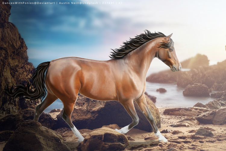
I’d love a critique on this when you get the chance :) |
|
|
| |
|
I love that piece!! Maybe add more shadows near the legs? |
|
|
| |

|
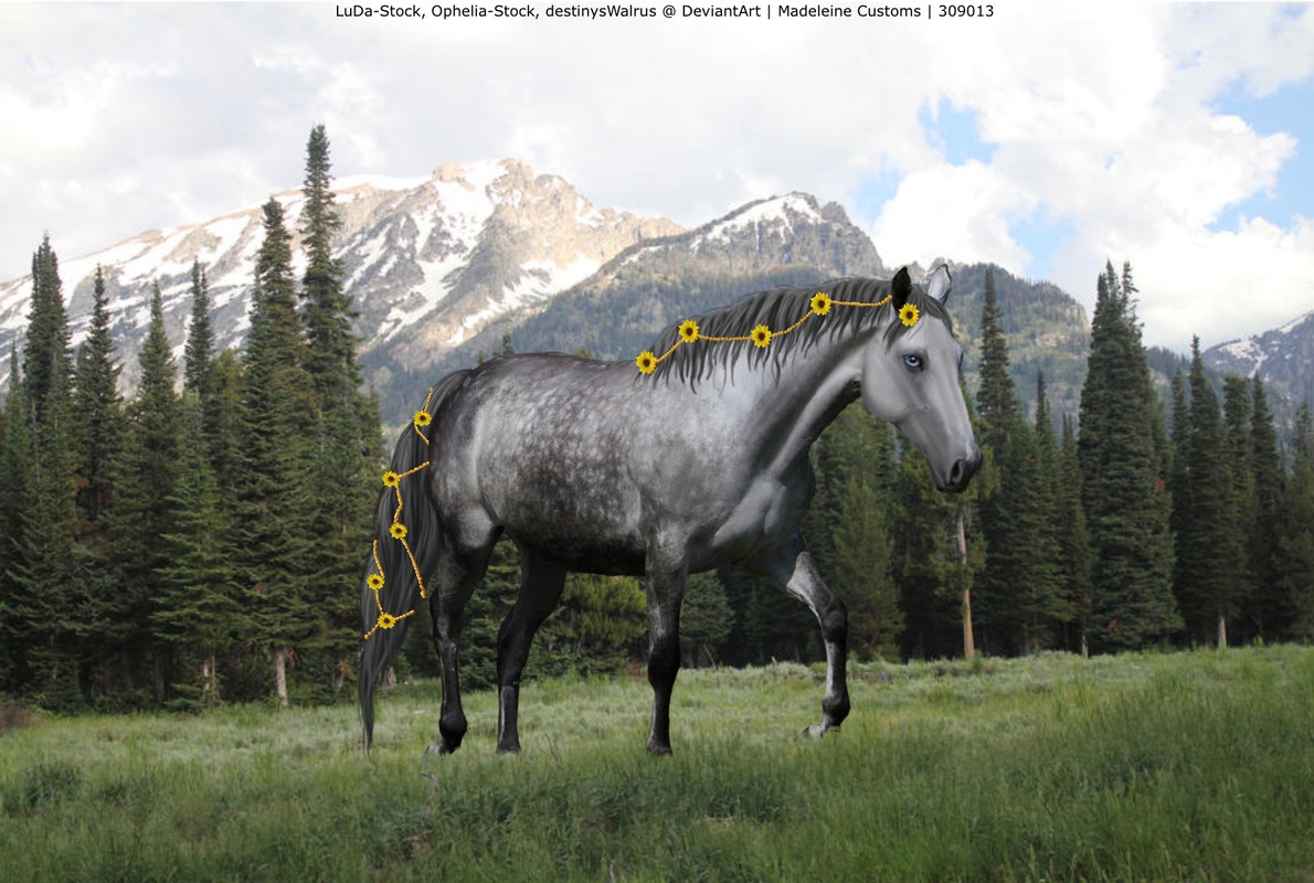
I finally had my aha moment with hair. I love how this turned out but I feel like it's missing something. Edit: moved the horse a little :) |
|  |
|
| |
|
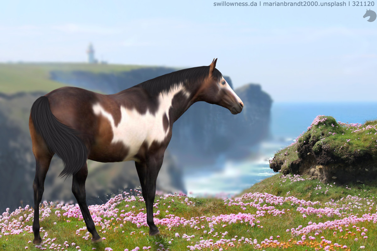
I'm not the best with critisism but when I see the horse placed in the very middle of the artwork it always seems to be missing something. Try adding a rock or small bump in the landscape next to the horse. Just a suggestion, it looks great even without it and I can really see improvement in your art! |
|
|
| |

|
When I'm making art, I divide the canvas with invisible lines, 3x3. I always have the horse head and neck in the middle column. Try moving the horse left. A lot. |
|
|
| |
|
I love how it looks, but if you added a longer mane with maybe a dash or white hair, (or possibly a tribal marking, and a small strand of hair that's the color of the marking) would help as well :) You did an incredible job!
Red River Ranch said:
I finally had my aha moment with hair. I love how this turned out but I feel like it's missing something. Edit: moved the horse a little :)
|
|
|
| |

|
Heya friends! Not really looking for criticism, but more of pricing help for an auction. Soo like SB, MI and AB :D
click for large. |
|  |
|
| |

Art Team
|
 bloop be as harsh as you need XD |
|  |
|
| |

|
not sure whats wrong with it, but the horse looks out of place, any tips for that? I feel like its missing something. Be as harsh as you need to be XD Edited at February 2, 2021 05:54 PM by ~Pegasus Lane~ |
|
|
| |

Art Team
|
Be prepared, this is going to be a really long post 😂 . @Olive Tree I love chonks and this is like the chonk of all chonks. First off, I don't feel like the perspective of the horse quite matches the perspective of the background image. You can try and play with this under Transform but I'm not sure if you will be able to make it look completely natural. Best reccomendation for that is to just be a little more specific in the background image next time. Second, I'd suggest lowering the saturation of the horse or adding a layer above it, setting that layer to color, and going over the horse a few times with a large grey airbrush. That will help the naturalness of this piece a lot. Aside from that, all I really have for you is to look at the size. That is like a mega chonk because it's head is taller than some of the tree's largest branches behind it; just something to keep in mind for next time. Very nice job cutting out the hair <3 . @Apex I think you should put a rubber band around your wrist and every time you feel tempted to give the horse a white outline, snap yourself. The horse already looks wonderful so there really isn't any reason to give it an outline. Body prep and hair are beautiful. My main critique for you would be lighting. 1. Identify your light source. Wherever it is coming from, make the corresponding part of the horse the most highlighted. 2. Identify the darkest part and make the shadows correspond with that. 3. Identify and objects (rocks in this case) that would cause any other differences in this lighting. Highlight and shadow accordingly.
Definitely darken all the left edges of the horse and tone down the highlights where they don't match the background image, particularly looking at the hips, top line, and stomach. All in all, a very beautiful piece and you should definitely be proud of it.
. @RRR Beautiful job on the hair! A little suggestion on that aspect would be to add a shadow beneath it on the horse for both the amen and tail. I'm not sure what is missing per say, I think it's beautiful the way it is. If you wanted to add something, you could add a bunny/bird or other small element. Going to look at lighting a little bit. There isn't a super direct light source in this piece so the shadow should more so be a fuzzy blob pretty much beneath the horse. I like that you blurred out the background, maybe get a little pickier with the blur brush where the flowers and blurred area meet <3 . @Madsie SB: 45-55k MI: 5k AB: 150-170k . @Zomb You nailed the colors on this one, love it! My main critique is lighting. The light spruce is distinctly coming from directly behind the horse. This means that the edges of the horse should be the lightest part and the middle should be the darkest. Some shading according to that would help immensely. Love the mane on this piece. Other than that, I'd work on grounding. Make where the hooves dark where they hit the ground and rather than blur/smudge them into the leaves, cut out leafy shapes in the hooves to make it look like the leaves are overlapping. I also really like the horse's facial expression, super cute <3 . @Pegasus The first thing I notice is that the horse doesn't really fit into its environment. This is mainly because of lighting. Lighten the entire horse significantly then highlight the top line and shoulders. After that, add a clipping layer above the horse, set it to color, and go over the horse a few times with a light greenish yellow, the color of the grass. Looking at where the horse's feet meet the grass, make the horse's legs fade into the grass using long eraser strokes to imitate the overlapping tall grass as opposed to shorter grass. Finally, the shadow wouldn't be quite so distinct as you have it now. Without a super direct light source the shadow is fuzzier and more under the horse. Hope this helps! <3 . Just to everyone, don't quote this post to reply 😂 |
|  |
|
 Crisp, Clear, and Cool