| |

|
What's the brush you use for hair for ibis Ponys? |
|  |
|
| |

|
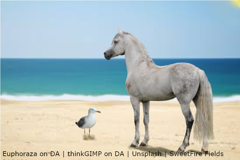
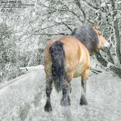
How's this? I think it's the shadow that needs work. It was a precut image, and I drew in all the fine hairs at the end. I actually like how this looks, but what do you guys think? (EDIT: Spelling and updated work) |
|
|
| |
|
|
| |
|
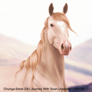
@SweetFire Fields, I feel as if there should be either a sun, moon, trees or something else to make it pop. I like it though, it looks great so far. I would also smooth out the body a little bit and then add more depth to where the muscles are. Also, you should look up some tutorials on how to do the eyes, I think s bright blue eye would definitely benefit this piece.
SweetFire Fields said:
Currently a work in progress, credits still needed, but how's this? I think it's the shadow that needs work. It was a precut image, and I drew in all the fin hairs at the end. I actually like how this looks, but what do you guys think?
|
|
|
| |
|
Can anyone help critique on this piece? |
|
|
| |

Art Team
|
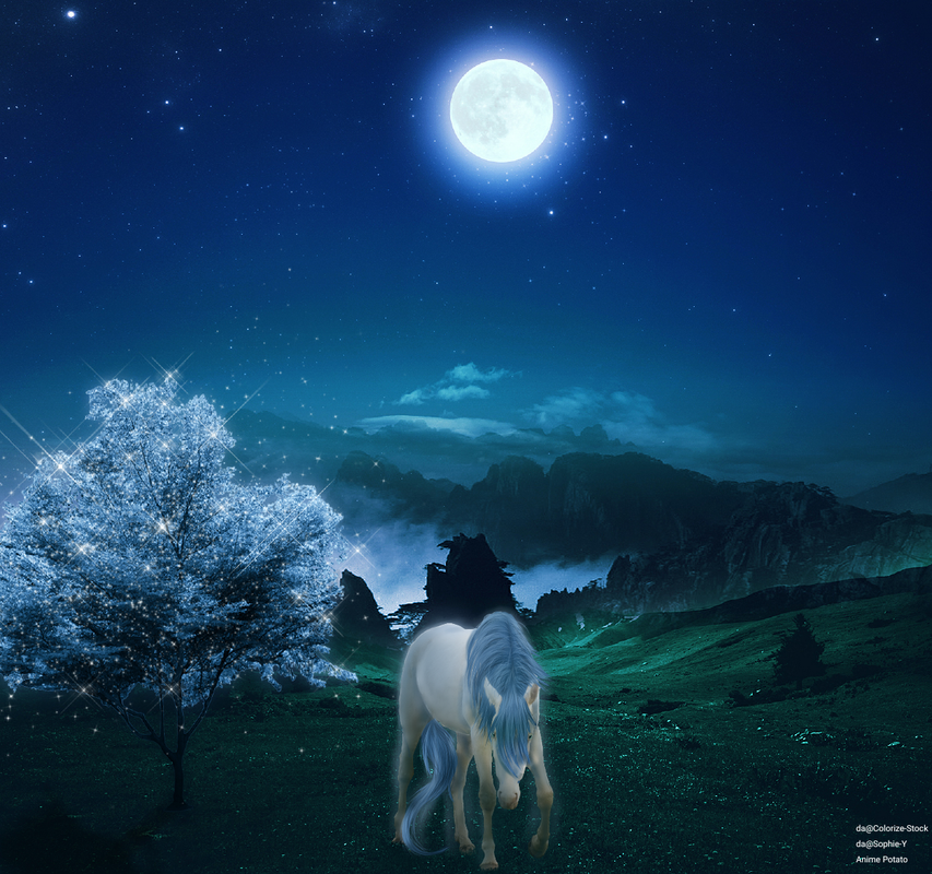
@Anime Really really like it but DA user Sophie-Y doesn't allow SIM game stock use |
|  |
|
| |

|
I'm quite happy with this, but I feel like I should get some critique so I can make my next piece better xD Might have overused the smudge feature a bit *shifty glance at the smudge button, which sits there batting its eyes at me* |
|
|
| |

Art Team
|
Gem said:
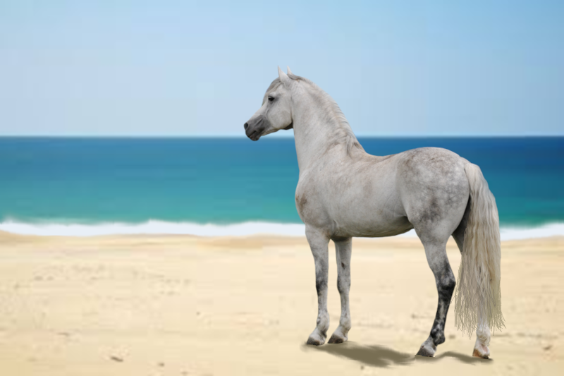
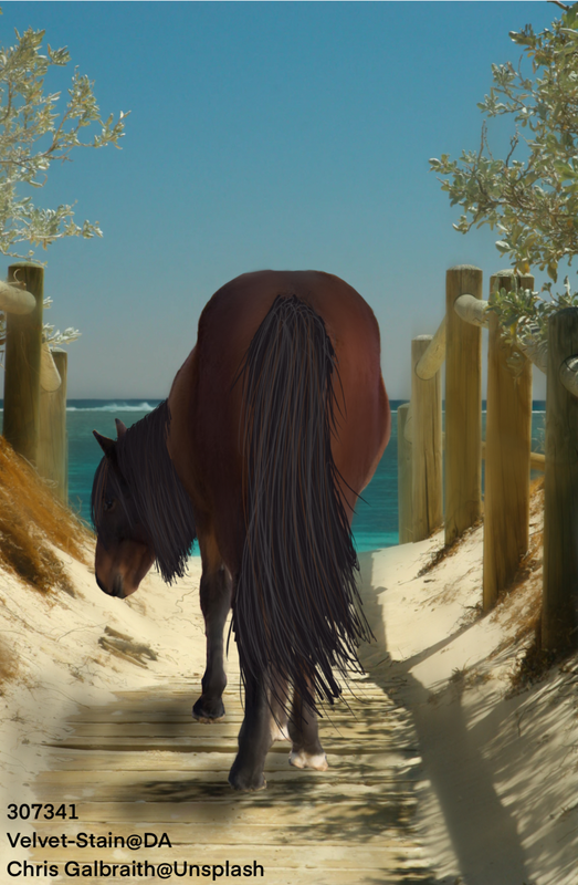
@Zomb I'm genuinely really torn on this piece. I really like the colors together but the contrast/lighting just completely throws me off. Both the horse and wings are really overhighlighted which takes away a big chunk of realism that is essential when you're trying to make a mythical creature. The color change was nicely done and I like the grounding. Even if you could just take the horse and Winn layers and play with the brightness and contrast settings, I think that would do a lot of good. Also, there is a really strong shadow on the horse's back leg farthest to the right. I would reccomend smoothing that out a little bit. I apologize if that came out a little harsh but I want you to be the best artist you can possibly be <3 . @Apex I love how this piece both encompasses sort of a spooky vibe along with a more serene vibe. Body prep and hair are nicely done. All I can really reccomend is to just significantly lower the white outlines of the horse. This is a common trend with your pieces but I don't feel that it's really necessary. If you do encounter a time when you can't really make out the horse, you could use a very slight outline but you would want it to be a lighter shade of the horse's coat as opposed to stark white. Overall, a beautiful piece <3 . @Anime First off, I really like the mane in this piece, especially the different parts. The head shape seems off to me a little bit like it's too thin to match the body but that could just be the original photo. If that is something you care to play with though, I'd suggest using Transform -> Mesh Form and just play with that area. I like that the horse is smooth but I feel it may be a little too smooth because you lost some of the muscling in the shoulder region, just something to keep in mind for next time. Looking at the rose petals falling, I'd recommend erasing parts of the ones by the horse's feet so it look like the horse is actually above some of them. Lighting, the horse is strong ly highlighted right on its withers but by looking at the tree on the left, the light source seems to be coming mainly from the right side of the image. Maybe illuminate the chest a little more and tone down the highlight on the withers. Final reccomendation would be to add a slight purple tint to the horse, especially the feet, to help it blend into the image. Absolutely beautiful! . @SweetFire I recognize the precut image which makes it a little entertaining to read the other critique you've been given so far. I agree with Fenn though that you shouldn't hide the feet. Just make the horse a little smaller and experiment with grounding. Sand is tough so it's definitely something that requires practice. I'd reccomend adding some highlighting to the top line of the horse and/or even increasing the brightness of the horse itself, just to match the brightness of the background image. Definitely look forward to seeing more art from you <3
Thank you! Be as harsh as you must be! :D I'll definitely take that into consideration in further pieces :) |
|  |
|
| |
|
SweetFire Fields said:
How's this? I think it's the shadow that needs work. It was a precut image, and I drew in all the fine hairs at the end. I actually like how this looks, but what do you guys think? (EDIT: Spelling and updated work)
Very nice! I agree with Anime, just maybe add a nice sun or something but it's a very big improvement and looks really good! |
|
|
| |

|
so i made this as a fun practice piece for a friend..bamboozle me |
|
|
 Morning Drizzle, but Clearing later