| |

|
I'm new to photomanips, so I'm greener than grass, fresh into the business. This is my best piece so far: (Why will it not show up?) |
|
|
| |

|
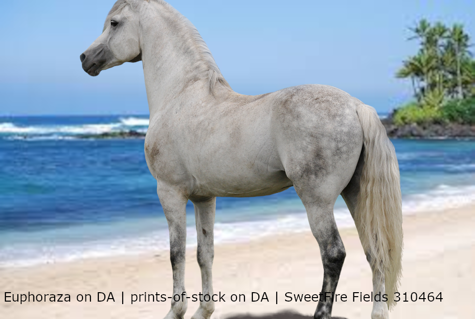
First off: the background stock is not very good. There are thousands of beach stock photos (try unsplash) that have a little more space for the horse to stand on. Also, try to size down the horse so its head and feet aren't chopped off. I highly recommend looking at a body prep tutorial. Those things are -lifesavers- and will teach you everything you need to know. There's some in the "guides" section of the forum that are super great. Other than that, I love how you've cut the mane and tail. A lot of learning artists either draw on their own mane and tail really terribly or cut the existing mane and tail into a gross blocky shape. Overall, really love the horse but your stock and image placement needs work. Practice makes perfect! |
|
|
| |
|
Fenntastic said:
First off: the background stock is not very good. There are thousands of beach stock photos (try unsplash) that have a little more space for the horse to stand on. Also, try to size down the horse so its head and feet aren't chopped off. I highly recommend looking at a body prep tutorial. Those things are -lifesavers- and will teach you everything you need to know. There's some in the "guides" section of the forum that are super great. Other than that, I love how you've cut the mane and tail. A lot of learning artists either draw on their own mane and tail really terribly or cut the existing mane and tail into a gross blocky shape. Overall, really love the horse but your stock and image placement needs work. Practice makes perfect!
It was a practice piece assigned by Tea, and a precut image lol. |
|
|
| |
|
Fenntastic said:
First off: the background stock is not very good. There are thousands of beach stock photos (try unsplash) that have a little more space for the horse to stand on. Also, try to size down the horse so its head and feet aren't chopped off. I highly recommend looking at a body prep tutorial. Those things are -lifesavers- and will teach you everything you need to know. There's some in the "guides" section of the forum that are super great. Other than that, I love how you've cut the mane and tail. A lot of learning artists either draw on their own mane and tail really terribly or cut the existing mane and tail into a gross blocky shape. Overall, really love the horse but your stock and image placement needs work. Practice makes perfect!
I agree with everything here. I suggest using a 3000x2000 px canvas or something large and long similar to that. It allows a lot of room for stock. Your tail cutting job is excellent! I do think the background is okay, as long as you make the horse small enough to fit on the sand or in the water depending on where you want it. I'd also suggest attempting to at least draw a little over the tail and maybe add a mane, just for practice :D Depending on what program you use, I could send you my favorite hair brush for ibispaint that's super fluffy looking and doesnt reqiure you to draw a million and a half strands xD And add a shadow. Shadows are what really help tie realism into most pieces. |
|
|
| |

Art Team
|
@Zomb I'm genuinely really torn on this piece. I really like the colors together but the contrast/lighting just completely throws me off. Both the horse and wings are really overhighlighted which takes away a big chunk of realism that is essential when you're trying to make a mythical creature. The color change was nicely done and I like the grounding. Even if you could just take the horse and Winn layers and play with the brightness and contrast settings, I think that would do a lot of good. Also, there is a really strong shadow on the horse's back leg farthest to the right. I would reccomend smoothing that out a little bit. I apologize if that came out a little harsh but I want you to be the best artist you can possibly be <3 . @Apex I love how this piece both encompasses sort of a spooky vibe along with a more serene vibe. Body prep and hair are nicely done. All I can really reccomend is to just significantly lower the white outlines of the horse. This is a common trend with your pieces but I don't feel that it's really necessary. If you do encounter a time when you can't really make out the horse, you could use a very slight outline but you would want it to be a lighter shade of the horse's coat as opposed to stark white. Overall, a beautiful piece <3 . @Anime First off, I really like the mane in this piece, especially the different parts. The head shape seems off to me a little bit like it's too thin to match the body but that could just be the original photo. If that is something you care to play with though, I'd suggest using Transform -> Mesh Form and just play with that area. I like that the horse is smooth but I feel it may be a little too smooth because you lost some of the muscling in the shoulder region, just something to keep in mind for next time. Looking at the rose petals falling, I'd recommend erasing parts of the ones by the horse's feet so it look like the horse is actually above some of them. Lighting, the horse is strong ly highlighted right on its withers but by looking at the tree on the left, the light source seems to be coming mainly from the right side of the image. Maybe illuminate the chest a little more and tone down the highlight on the withers. Final reccomendation would be to add a slight purple tint to the horse, especially the feet, to help it blend into the image. Absolutely beautiful! . @SweetFire I recognize the precut image which makes it a little entertaining to read the other critique you've been given so far. I agree with Fenn though that you shouldn't hide the feet. Just make the horse a little smaller and experiment with grounding. Sand is tough so it's definitely something that requires practice. I'd reccomend adding some highlighting to the top line of the horse and/or even increasing the brightness of the horse itself, just to match the brightness of the background image. Definitely look forward to seeing more art from you <3 |
|  |
|
| |

|
So this is a question based off ponys imaginations comment, what size canvas is usually recommended? I usually try using a 1,000 by 1,000 pixel canvas because I had read on one of the turtorials on here that was what someone else was using, but when I read her recommending 3,000 by 2,000 pixels I was curious if it would be better for me to try a larger size? |
|
|
| |
|
SimplySweetStables said:
So this is a question based off ponys imaginations comment, what size canvas is usually recommended? I usually try using a 1,000 by 1,000 pixel canvas because I had read on one of the turtorials on here that was what someone else was using, but when I read her recommending 3,000 by 2,000 pixels I was curious if it would be better for me to try a larger size?
3000 x 2000 is basically a big rectangle, which in my opinion allows more space to fit a horse and other elements in, especially if you plan on adding other animals or large wings for instance. it's easier than using a square in my opinion, since I work with a lot of multi-aspect art with more than one subject. but it really depends on what the piece is or you plan for it to be ^^ |
|
|
| |
|
Thank you! I think I'll try that on my next piece :) |
|
|
| |
|
SimplySweetStables said:
Thank you! I think I'll try that on my next piece :)
of course! |
|
|
| |
Art Team
|
SimplySweetStables said:
So this is a question based off ponys imaginations comment, what size canvas is usually recommended? I usually try using a 1,000 by 1,000 pixel canvas because I had read on one of the turtorials on here that was what someone else was using, but when I read her recommending 3,000 by 2,000 pixels I was curious if it would be better for me to try a larger size?
Honestly, it really depends on the size of your background image because you don't want to make it so big that you lose image quality. I try to stick to around the original image dimensions (usually about 1500 x 700) unless I'm doing a background merge. |
| |
|
 Morning Drizzle, but Clearing later