| |

|
Here is one that I have been putting off for a little that I finally finished.... I think lol https://postimg.cc/BXp12dKg |
|
|
| |
|
Critique please! The eye feels too bright for me, any tips on how to change that? I had to remove a saddle, so I'm aware that it doesn't look that sleek. Any tips on how to tack remove neatly on Ibis? Edit: Switching pieces <3 |
|  |
|
| |
|
Tanglewood said:
Critique please! The eye feels too bright for me, any tips on how to change that? I had to remove a saddle, so I'm aware that it doesn't look that sleek. Any tips on how to tack remove neatly on Ibis? Edit: Switching pieces <3
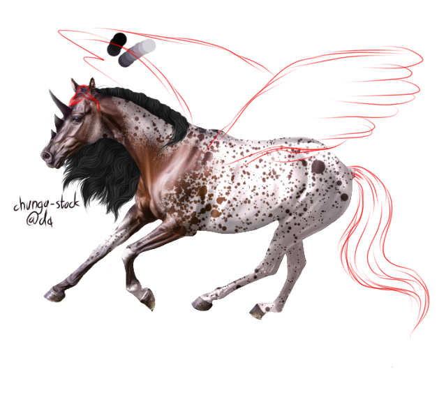
Switching pieces for critique :D Critique mainly on the mane, markings and body prep - eye, tail and hooves still need to be finished. Any tips on how the forelock and ta should be shaped? And on how to make those dang horns look *faintly* realistic please :) I'm planning on adding wings to this one, but I'm pretty stuck on what position they should be. 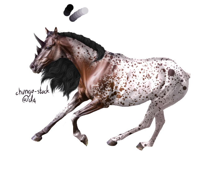
|
| |
|
| |

Art Team
|
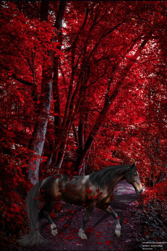
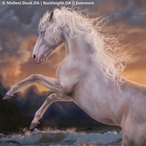
@RRR Beautiful job on the feathers!! Horse is pleasingly smooth and well cut out. Looking at the mane and tail, I like the different shades but I'd reccomend 1. Adding more strands at the bottom so it doesn't look like tassels coming off of a solid object and 2. Turn on the force fade feature when drawing hair (top right hand corner, little hand with pointing finger on Ibis Paint X). Force fade really helps the realism of a piece. Other than that, I'd say to work on grounding a little bit, erase some of the feathers to make it look like the leaves are overlapping the foot. Great job! . @Apex I have got to get some art from you one of these days, just beautiful. The horse and its hair fit into the background very very nicely. You definitely have the natural look down. The main thing I'd reccomend is to work on grounding. Snow and sand are the absolute hardest and personal enemies of mine. For the foot farthest to the left, I'd suggest adding a spray of snow caused by the horse prancing. Aside from that, play around with adding some hoof prints to the right side of the image to add realism.
. @Tangle I'm just going to critique both pieces because I have the first piece open as well. Original piece w/ horse jumping: Absolutely hands down gorgeous. The muscling is absolutely on point. Hair too. I don't genuinely have much to critique on that one besides adding a show of the horse on the wall. I actually like the eyes but you could go eight a deeper brown if you choose :) WIP piece: I swear, you have muscling down way better than I do, really really well done. The markings are beautiful, could tell instantly it was a near leo. The mane is beautiful. I'm thinking something like this for the rest of the hair/wings. Also, I cannot sketch wings apparently 😝 |
|  |
|
| |
|
Oh thank you! I will definitely try and see what I can do. :) |
|
|
| |
|
|
| |

Art Team
|
she is not yet fully completed. However, what do ya'll think? |
|  |
|
| |

|
Thanks Gem I really appreciate the advise :) |
|  |
|
| |
|
Would appreciate your tips and thoughts :) |
|
|
| |
|
How can make this horse seem like it belongs? |
|
|
 Morning Drizzle, but Clearing later