| |

|
Hey guys! I had a few questions, sorry if im not supposed to post theses here. But can anyone help me or give me some tips on Shadowing Mane and Tail and Adding or markings Again if I cant post these here I will find somewhere else to post them! Thank you all :) |
|
|
| |

|
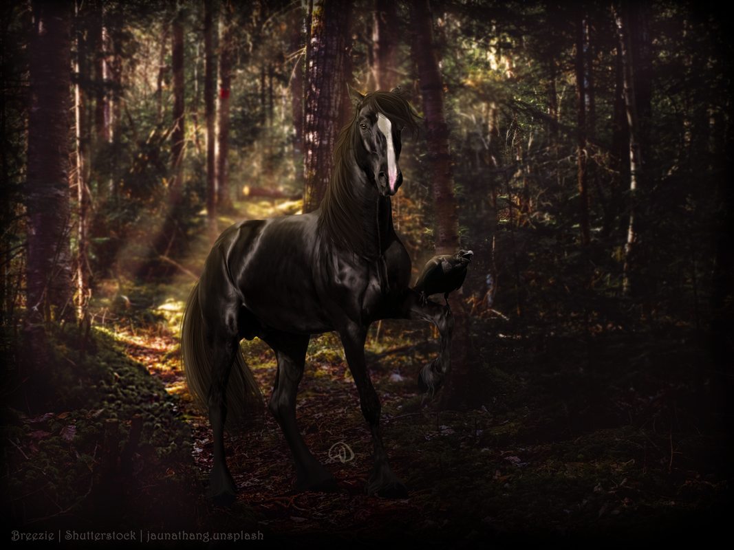
Finished this yesterday after nearly a month of not doing manips. Mind ripping it up for me? Thanks in advance! <3 |
|  |
|
| |

|
Finished this late last night with some very tired, but motivated eyes. Would appreciate some input, thanks! :) |
|
|
| |

|
I am basically new to manips and made this piece trying to follow some turtorials on da. I could use help with finding more turtorials and tips that could help me learn. I use affinity photo and procreate on my iPad to make my art. But most photoshop buttons are in affinity photo so I can use photoshop turtorials for it. Thanks in advance!
|
|
|
| |

Art Team
|
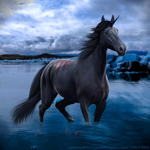
@Breezie Body prep is executed perfectly. Very nicely done. Hair is beautiful, per usual. My little suggestion on the mane would be rather then having the highlights be a slight green tint to make them more of an orange/brown/gold hue. Same thing with the rest of the horse, plus tail. My main suggestion is to look at lighting. All of the horse's muscles are really strongly highlighted, including the muscles on the complete opposite side of the light source (chest, face, raised front leg). Maybe darken those some and add slightly stronger highlights to the areas affected by the light source (back, edge of rump). Raven is a very cool touch <3 . @SSS First thing I'm going to say is that the mane and legs into the water transition looks very nice, very natural. Body prep is very smooth. The smoothness works for the majority of the horse but you lost a lot of anatomical features in the face, particularly the cheek bone. I'd reccomend looking at some reference photos to try to recreate where it should be. Second, lighting. The highlights on the horse are all well done except when looking at the horse's top line. Maybe it's meant to be a dun stripe but it looks more so like you have a really large shadow on top of the horse when that should actually be your strongest point of highlighting. Also on that note, I'd suggest adding a few more shadows to the bottom of the horse's stomach to make that your darkest shadow. Finally, the reflection. Typically reflections are a lot more clear and visible unless the water is choppy for some reason. I don't think choppiness applies here. I would reccomend diplicating all horse/hair layers, merging the duplicates together, flipping it vertically, lining it up with legs/hair, then playing with blending mode and opacity to your satisfaction <3 . Edit: @Apex, I would be very happy to help you out with the piece but Postimg says it can't be found <3 |
|  |
|
| |
|
Thank you, gem! Working on those areas now :) |
|
|
| |

|
I'm really proud of the way this turned out (one of my best manips yet, I think) but if anyone has any constructive criticism it would be appreciated. |
|
|
| |
|
Night Shadow Stables said:
I'm really proud of the way this turned out (one of my best manips yet, I think) but if anyone has any constructive criticism it would be appreciated.
This looks beautiful! Great job on the markings and hair! I would suggest taking a look at the legs where they meet the water. It's a very sudden change. Personally, I would add little ripples around the legs as well as a few splashes since this horse is running through the water. This horse is also missing a reflection on the water. Other than that, this is an amazing piece! Keep up the good work! |
| |
|
| |
|
Sorry the link wasn’t working for some reason. Here is a working one :) https://postimg.cc/YGzmJHdC |
|
|
| |
Art Team
|
@Apex All good! The piece is very very nice, very natural and aesthetically pleasing. I like that the horse is very clearly the center of attention. Mane and tail are natural, appreciative of the different hues. I notice what you did with the grass to ground the feet, well done! On that note, maybe make the grass beneath the farthest forward foot slightly darker so it is more in shadow of the foot. Looking at body prep, the highlight sim the horse are very strong considering the background is relatively cloudy. Maybe go over the highlights with a largeish airbrush a few times in the color of the horse. Besides that, I'd take a greenish grey color and just go over the horse a few times to make it more suited to its environment, especially the lower stomach. Finally, lower the opacity of the white outlines around the horse to add another element of realism. Beautiful work! |
| |
|
 Morning Drizzle, but Clearing later