| |
|
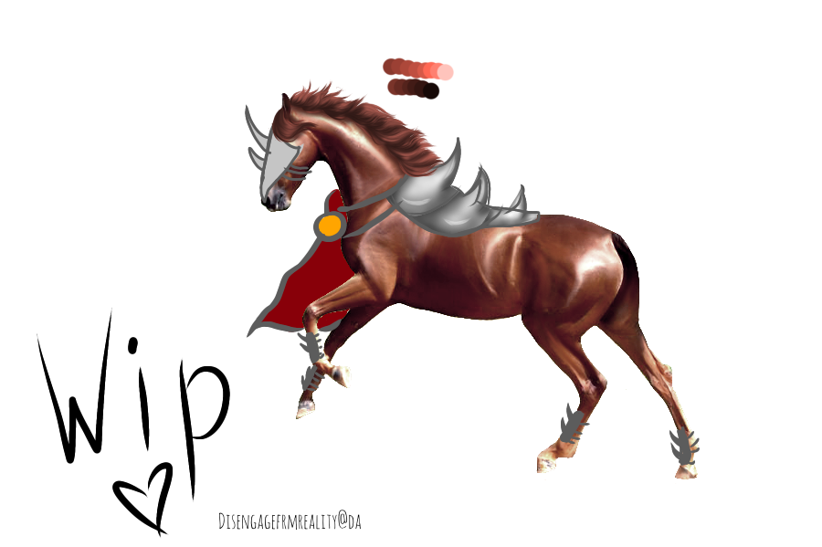
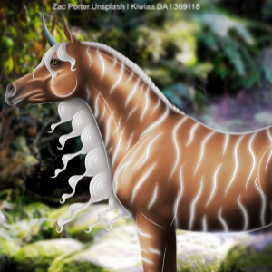
Looking for critique on the mane of this WIP, ideas for tail placement and general tips for the later stages :D (armour, robe, etc.) Basic smudge body prep has been done, but I'll add the more definitive prep once ive figured out the lighting :) |
|  |
|
| |
|
What can i improve? And what do you think something like this could go for? (This is a commission, it wont be up for auction) |
|
|
| |
|
Edited at December 27, 2020 11:45 AM by Cando Farm
|
|
|
| |

|
Lookin good, Tangle! Wasn't sure how to describe tail placement so I just drew somethin on to give you an idea. Hope you don't mind. When painting your tail make sure to pay attention to how the horse and mane are moving so you can keep the same flow.

Your mane looks really good! I'd just add some more small white strands to it. I'm not practiced in painting those kind of add ons so I can't really help you there. I just recommend-- and I can't stress this enough-- looking at lots of photos of armor/clothing online to figure out how they "work". |
|
|
| |
|
Amhain Dull Liath said:
Lookin good, Tangle! Wasn't sure how to describe tail placement so I just drew somethin on to give you an idea. Hope you don't mind. When painting your tail make sure to pay attention to how the horse and mane are moving so you can keep the same flow.
Your mane looks really good! I'd just add some more small white strands to it. I'm not practiced in painting those kind of add ons so I can't really help you there. I just recommend-- and I can't stress this enough-- looking at lots of photos of armor/clothing online to figure out how they "work".
Thanks so much Mish, very helpful :) |
| |
|
| |
|
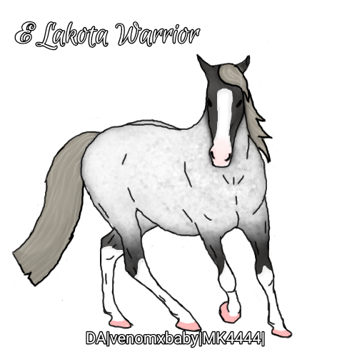
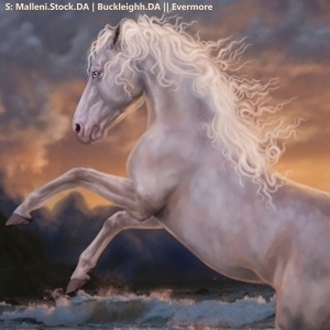
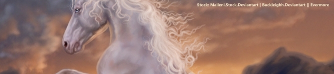
This took me a while, what do you think? |
|  |
|
| |

|
As much as I love this I want someone to absolutely rip it to shreds! I tried something new with the body painting/prep as well as with the hair. Tell me what you liked, what you think I could improve on and just overall critiques :D Thank you so much in advanced! |
|
|
| |

Art Team
|
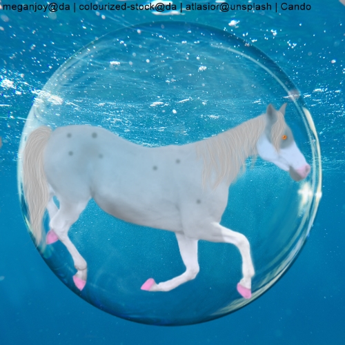
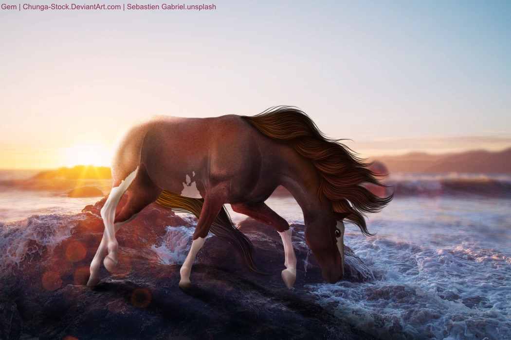
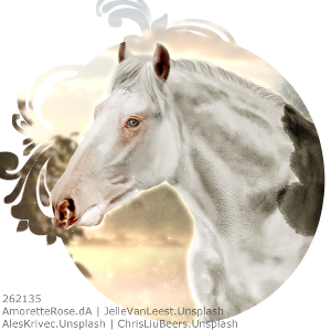
@Cando I really like the concept but I don't feel the horse looks very natural. I think this could be helped by some more shading and body prep. Looking at the contrast level of the bubble, you could try upping the contrast of the horse layer to help. From there, make the bottom edges darker and the upper edges lighter. Check out some reference images for clarity on where to detail the muscles and other features. Other than that, the pink hooves stock out to me. Would definitely reccomend desaturating them significantly and shading the edges away from the light source - the top of the image. Finally, I would recckmend adding a shadow underneath the mane on the horse :) . @ M&E I think the color change is done very nicely! Love the silver. First, I'd say to try drawing the rest of the hooves or at least giving the viewer a reason for them being cut off. I know that in reality they were covered up by grass/dirt but without drawing that, it looks like the horse has some serious hoof issues 😜 Second, more shading, especially on the chest, would add a whole other element of realism to this piece. Finally, the hair. The mane and tail are blowing opposite firections which, to me, is semi confusing. That is really up to you though as it is a possibility <3 . @Tasi I seriously adore the elegance of this piece. Very serene. First thing I'd say would be to add a shadow beneath the mane on the neck and face. Second, I feel like adding a reflection of the light in the horse's eye would really bring the horse to life. Third part I'm going to mention would be the foliage overlapping the horse. At first glance, it is very nice. Upon closer inspection though there's one area in particular where the flower changes opacity when 'overlapping the horse'. Currently looking at the leftmost back leg, near the hock. Would reccomend very gently erasing that area a little more. Finally, taking a look at the tail, particularly the base. Very nice start with some little ringlets farther down but then it seems to just end. It's not really going behind the flowers because that leaf is already behind the horse's rump, or continuing behind the horse. It just sort of stops. I'd reccomend adding a few more strands coming from eighth where that ends and continuing behind the horse just to add a bit more flow. Wish I could steal this piece, beautiful work <3 |
|  |
|
| |
Art Team
|
Contest entry. Please be gentle on my heart though 😜 |
| |
|
| |
|
I don't feel like I'm certified to give criticism, but I'll try. It's super pretty, but I feel like the horse is unrealistically floating over a few feet of water. That could be a rock or a wave, my eyes can't really tell. |
|  |
|
 Morning Drizzle, but Clearing later