| |
|
Any critique on the background so far?
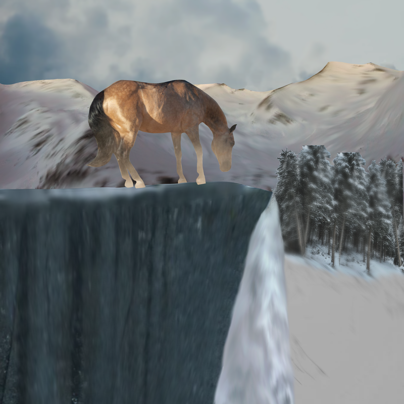
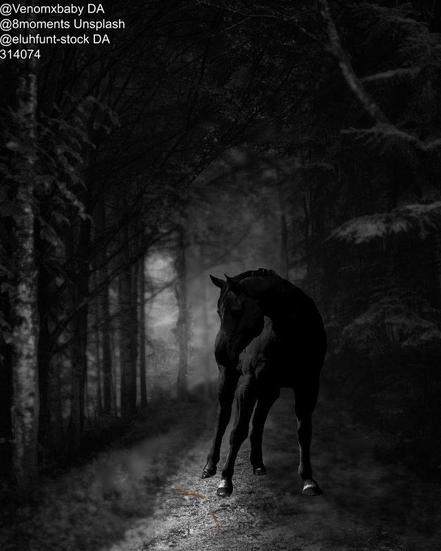
I need some help getting rid of all the dusty part on the horse itself, so any help there would be excellent too! This is by far my most complexe piece yet :D |
|
|
| |

|
I'd be rich if struggling was a job ;v; Gimme anything - |
|
|
| |

|
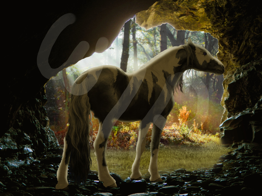
@ Ponys Imagination The background is looking alright! I feel like it's been too smudged though, it looks extremely unnatural. Your trees are much to large where they are and should be pushed back to add to perspective. ;) The cliff is very flat....I'd recommend find an image of a cliff where it's a bit more turned down to give that looking down perspective (kind of like this image: https://unsplash.com/photos/VAJnY5xM33w) Dust should be relatively easy to be rid of. You might be able to just add an Overlay layer, select a darker color of what you'd like it to be, then use a lower Opacity Airbrush tool to dark up the areas that are dusty. A little bit of detail work may be needed, like added shadow and highlight to the prominent tendons. This can be done with some small airbrushes and very fine Pencil or Pen tools to add in those super fine highlights. @Amhain Dull Liath First off, these are simply gorgeous! Your first one I'd recommend harsher light coming from the left side and much darker shadows particularly on the inside cheeks and neck and the belly closest to the camera. Other than that, I see nothing wrong at all! Same thing with the second piece except probably just darker shadows. ^^ |
|
|
| |

Art Team
|
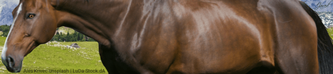
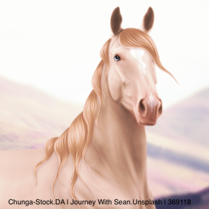
@Mish How much to steal the second one? Gorgeous beyond words. Your muscling on both pieces is spot on but especially the face in the first one. Something about the first one has me wondering if the horse's head would be casting more of a shadow on the neck, could play around with that and see what looks most natural. Looking at the second one now because I can't just look at them one at a time and give critique in order, more of a shadow underneath the mane would add another element of realism. Second suggestion of the second piece is to look at grounding. I feel like the horse is just kind of placed on top of the leaves as opposed to standing in them. Erase gently some edges-of-leaf-like shapes in the feathers/hooves to help correct this. Also, make the horse's shadow strongest directly beneath the feet. Totally cool with the surreal lighting of the rose. Please please contact me if you think about selling the second one <3 |
|  |
|
| |

|
Still need help with this <3
Wintergreen Gardens said:
Here is a WIP I started last night, thought I would get some input on it :D Not sure what im gonna do with it, might auction it, might keep it and make it into a set. Not sure yet :) Anyways! I am trying a few different syles and I think I like this one the best so far <3 Im thinking about adding anters or some form of horns, we will see >:3
|
|
|
| |
Art Team
|
@Winter Whcih parts are still in progress so I know what to critique? |
| |
|
| |
|
Just the general piece :)
Gem said:
@Winter Whcih parts are still in progress so I know what to critique?
|
|
|
| |

|
Thoughts on this? Specifically the eye. I tried to airbrush over the edges in the gray color around the eye, but I'm not sure it worked. Should I lower the opacity? Darken it? |
|
|
| |
|
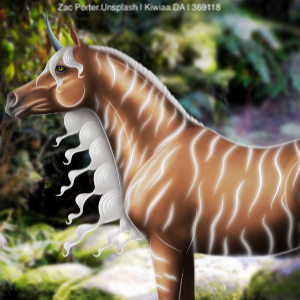
 thoughts? It was my first time using ibis. |
|  |
|
| |
|
TenaciTena, The grounding, look at how the hooves seem to hoover over the ground, they dont really seem to fit on the ground. I'd take an airbrush and lightly go over the bottom of the hoof and brush over it a bit. then draw some more strands on the hoof. And try redrawing the hoofs, and the back one just looks like a triangle. Otherwise there is nothing else, cause its really dark. |
|
|
 Morning Drizzle, but Clearing later