| |

|
Purple Pegasus Farm said:
Thanks in advance!
Looks quite good, lighting is pretty. Gorgeous colors. |
|
|
| |
|
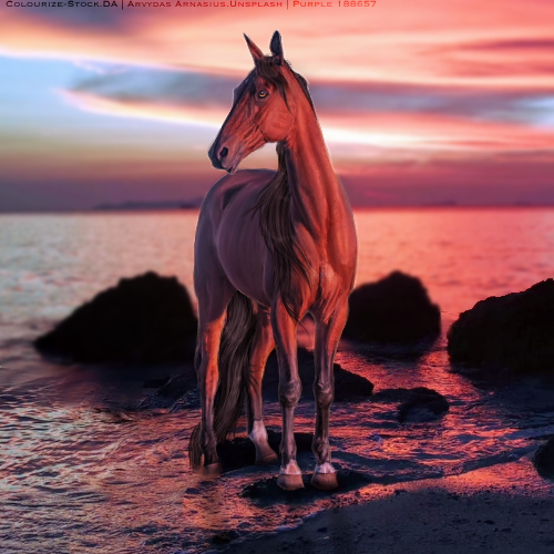
Gem- very nice, I like it though, one major thing that sticks out to me is, the horse takes no color of the surroundings. The shadowing is kinda confusing me, cause there is a good amount of lighting on the butt. But yet the shadow is too the side. And the back hoof at the very back, just has this cut off where the skin ends and the hoof begins. Sorry if I sound rough, lol. |
|
|
| |

Art Team
|
@Cando I do see what you're saying about the colors. I'll play around with that :) |
|  |
|
| |

|
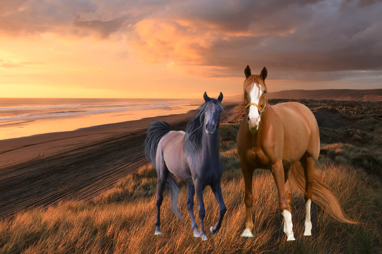
So let me just start off by saying this is wildly beautiful - the overall composition of colors/palette is outstanding it really compliments the horse's coat. My only critique are macro fine-tunings that come with time. First, the energy and motion of the water would likely be creating some sort of ripple or splash with the hoof that is submerged - very subtle, but I'd add bit of motion in that area, along with a very rippled reflection of the fetlock. You could also change direction of the tip of the tail so it appears to be dragging with the waves in the water. The only other thing that stands out to me is the position of the pupil in the eye. Based off the direction of the horse's head, the iris and pupil would likely be directed more downwards rather than sitting in a straight direction like they are - I would actually center the pupil in the eye instead of making him look up, it throws the proportions of the head off EVER so slightly. Add some shading near the top of the eye near the eyelid to give it depth. The reflection of the horse's eye would likely be facing the nearest point of the light source, so instead of making the lightsource in the upper left corner, maybe move it to the bottom right side where the light is hitting the water and the horse's body. Again, fabulous work, and if you'd like a further explanation on any of this, let me know.
Purple Pegasus Farm said:
Thanks in advance!
|
|
|
| |

|
i need help with grounding and lighting! i have no clue how to go about this!! |
|  |
|
| |

|
Timber Canyon said:
So let me just start off by saying this is wildly beautiful - the overall composition of colors/palette is outstanding it really compliments the horse's coat. My only critique are macro fine-tunings that come with time. First, the energy and motion of the water would likely be creating some sort of ripple or splash with the hoof that is submerged - very subtle, but I'd add bit of motion in that area, along with a very rippled reflection of the fetlock. You could also change direction of the tip of the tail so it appears to be dragging with the waves in the water. The only other thing that stands out to me is the position of the pupil in the eye. Based off the direction of the horse's head, the iris and pupil would likely be directed more downwards rather than sitting in a straight direction like they are - I would actually center the pupil in the eye instead of making him look up, it throws the proportions of the head off EVER so slightly. Add some shading near the top of the eye near the eyelid to give it depth. The reflection of the horse's eye would likely be facing the nearest point of the light source, so instead of making the lightsource in the upper left corner, maybe move it to the bottom right side where the light is hitting the water and the horse's body. Again, fabulous work, and if you'd like a further explanation on any of this, let me know.
Purple Pegasus Farm said:
Thanks in advance!
Thank you Timber! I redrew the eye about ten times or so because I couldn't quite figure out what was off about it. So that's very helpful input. I've also been trying to get submerged hair to look appropriate with my last handful of pieces. Those are a few ideas I'll play around with in the near future. For some silly reason I hadn't thought of painting the tail flowing with the direction of the tide and that makes much more sense than what I was doing there. :D |
|
|
| |

|
Thanks for the help, Misha!
Cain Manor said:
i need help with grounding and lighting! i have no clue how to go about this!!
Cain- First of all, that hair is gorgeous! For lighting, it looks like your light is coming from the left side of the piece, like the sun is setting over the water. So shadow the (viewer's) right side of the chestnut, add some highlights to the black's left. Keep the direction of the light in mind and fiddle around with it. Shadows are no easy thing to do as I've learned, but mastering it comes with trial and error. For grounding. Your horses are standing in tall grass, so definitely fade out the bottom of their hair a bit where you percieve the ground would be, and take a teeny eraser and erase where the grass is over the hoof and leg. Not a ton, but that will help. Don't forget the shadow, that will help as well! I'm no professional but that is what I've noticed in my own works that should help ^^ |
|
|
| |

|
Well, I haven't done any art in ages, so I'd love a critique on this piece, and maybe an estimate on price? thanks in advance! Edit: Here's my attempt at a thicker tail :) |
|  |
|
| |
Art Team
|
@Silver Well that's really frickin amazing. Just wow. The body prep, the lighting, the blending, the realism in general is absolutely breathtaking. The only critique I can give is on the hair, especially the tail. It's currently rather thin. I'm actually going to commend advice Mish - Amhaim Dull Liath - gave me about seven months ago and helped me tremendously.
. "I recommend (for hair) using a soft dip pen sized 1.7 on force fade stabilizer. It's a good size for most pieces. Use it to make the outline for your hair and to do the first layer of highlights. I use a new layer for each new set of highlights / shadows I do, so that I can toy with opacity before merging everything. The brush sizes I use for doing hair are 1.7, 1.4, 1.1, and 0.8. You go down 0.3 for each new layer. The smaller the brush, the lighter the color used for highlighting. 0.8 is usually almost all white. It's also the size I use to add more shadows / definition to the hair, using the base color. This system is what works best for me, so I figured I'd share :) . Oh, and when I'm outlining / filling the base of the hair, I use a bright red color so that it stands out from the rest of the piece. It's pretty helpful. Once you've got the shape down, use filters>mono color to change it all to the base color you want." |
| |
|
| |
|
Gem said:
@Silver Well that's really frickin amazing. Just wow. The body prep, the lighting, the blending, the realism in general is absolutely breathtaking. The only critique I can give is on the hair, especially the tail. It's currently rather thin. I'm actually going to commend advice Mish - Amhaim Dull Liath - gave me about seven months ago and helped me tremendously.
. "I recommend (for hair) using a soft dip pen sized 1.7 on force fade stabilizer. It's a good size for most pieces. Use it to make the outline for your hair and to do the first layer of highlights. I use a new layer for each new set of highlights / shadows I do, so that I can toy with opacity before merging everything. The brush sizes I use for doing hair are 1.7, 1.4, 1.1, and 0.8. You go down 0.3 for each new layer. The smaller the brush, the lighter the color used for highlighting. 0.8 is usually almost all white. It's also the size I use to add more shadows / definition to the hair, using the base color. This system is what works best for me, so I figured I'd share :) . Oh, and when I'm outlining / filling the base of the hair, I use a bright red color so that it stands out from the rest of the piece. It's pretty helpful. Once you've got the shape down, use filters>mono color to change it all to the base color you want."
Thanks so much for that! I'll have a go at thickening up the tail a bit, it's definitely what I struggle with the most, especially with using a mouse. The tip will be super helpful, though I'll have to see if I can apply it to using gimp :) |
| |
|
 Morning Drizzle, but Clearing later