| |

|
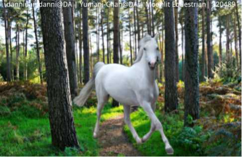
Any critique on this? I am working on art to sell in the Teir 3 part of the forum. |
|
|
| |
|
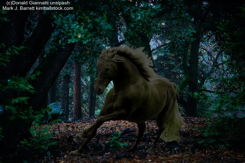
Any help on this? 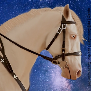 |
|
|
| |

|
Moonlit Equestrian said:
Any critique on this? I am working on art to sell in the Teir 3 part of the forum.
first off the image is very very blurry. it seems the horse isn't cut out very well or grounded. you need to have a shadow and you need to add more strands and fly outs to the mane and tail. <3 |
|  |
|
| |

|
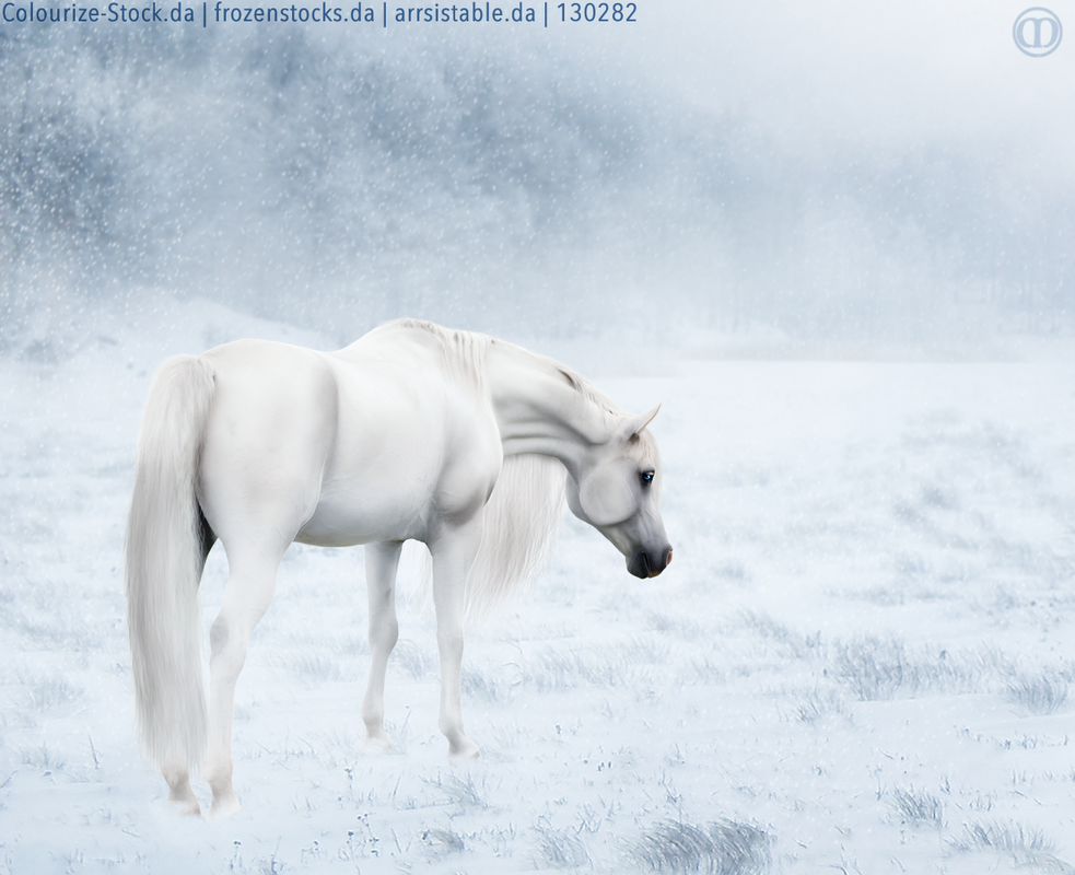
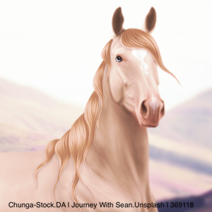
Clicky image :) I'd love some constructive feedback. I started to teach myself how to paint hair this week and this is my first piece with my new method. |
|  |
|
| |
|
Merryland Farm said:
Clicky image :) I'd love some constructive feedback. I started to teach myself how to paint hair this week and this is my first piece with my new method.
I think it looks great! From afar the tail looked a bit like a large blurred blob, so maybe adding more high/lowlights or a small shadow could help give it a little more depth? |
|
|
| |
|
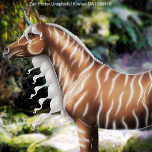
New peice but idk if it needs more added that i dont know about. I tonned it like a friend said i should but idk |
|
|
| |

Art Team
|
@Moonlit Equestrain Going to agree with Cain that the image is very blurry which significantly decreased the worth overall. I'm not sure what the cause of this is but it may have something to do with the size it was saved as or the art program you use. If you can manage to fix that part of it then I'd be happy to provide you with more feedback as it's somewhat difficult to see right now <3 . @Cando First thing I'd say is to tint the horse blue/purple a little bit to make it blend into the background. The current color combination is not my favorite. Horse is well cut out and smooth. Not sure how realistic you're going for lighting-wise. If going for realistic, significantly darken the horse and use an overlay layer to highlight the edges of the horse and its mane.
. @Merryland Body prep and muscling is absolutely stunning, beautiful job especially on the neck and face. I do feel that the same muscling didn't quite carry over to the back legs in particular, rather monotextural. I agree with Pony that you could add a bit more contrast to the hair but a very nice job for starting off. Only other suggestion is to add a slight shadow beneath the horse, very light. . @Golden Loghting looks very nice in this piece. One of the first things I noticed is that the image overall is very pixelated. Not sure which art program you use but that may have something to do with it. Second, the mane and tail are somewhat blocky, for lack of better word. They're just not very natural. A simple solution at the stage would be to take a smudge brush and lengthen the hairs to make them more realistic. Maybe draw in an eye for the horse as well unless you're going for more of a creepy vibe :) |
|  |
|
| |
|
Gem said:
@Moonlit Equestrain Going to agree with Cain that the image is very blurry which significantly decreased the worth overall. I'm not sure what the cause of this is but it may have something to do with the size it was saved as or the art program you use. If you can manage to fix that part of it then I'd be happy to provide you with more feedback as it's somewhat difficult to see right now <3 . @Cando First thing I'd say is to tint the horse blue/purple a little bit to make it blend into the background. The current color combination is not my favorite. Horse is well cut out and smooth. Not sure how realistic you're going for lighting-wise. If going for realistic, significantly darken the horse and use an overlay layer to highlight the edges of the horse and its mane.
. @Merryland Body prep and muscling is absolutely stunning, beautiful job especially on the neck and face. I do feel that the same muscling didn't quite carry over to the back legs in particular, rather monotextural. I agree with Pony that you could add a bit more contrast to the hair but a very nice job for starting off. Only other suggestion is to add a slight shadow beneath the horse, very light. . @Golden Loghting looks very nice in this piece. One of the first things I noticed is that the image overall is very pixelated. Not sure which art program you use but that may have something to do with it. Second, the mane and tail are somewhat blocky, for lack of better word. They're just not very natural. A simple solution at the stage would be to take a smudge brush and lengthen the hairs to make them more realistic. Maybe draw in an eye for the horse as well unless you're going for more of a creepy vibe :) Thank you Gem! your art is amazing!
|
|
|
| |
Art Team
|
Oh why thank you! It makes me happy to have you say that 🥰 |
| |
|
| |

|
So this piece is far from done. Obviously, it doesn't even have a horse yet. But for some unknown reason I decided I wanted to merge backgrounds, and so far this is the result. My question is, how do I get rid of that tree stump? I know the edges and everything else is currently extremely rough, but my main concern is the stump. I use ibisPaint, so I have no clone tool or anything.  |
|
|
 Morning Drizzle, but Clearing later