| |

|
Thank you Gem!!! I will work on that! :D
Gem said:
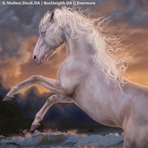
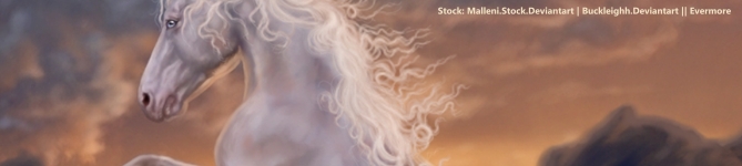
@Purp The body prep and muscling is really really nice. The horse fits well with the background and three of the feet are very well grounded. My issue is with the front, lifted foot. The viewer can see the entire hoof but I think you intended the tip of it to be underwater. I don't think that works in this cause because you can't see any of the other legs or even part of the other legs underwater. So maybe erase the tip of the hoof and give it a little splash. My only other suggestion is to take a look at the hair. To me, it seems somewhat pixelated. I would teccomend trying again with a softer brush. Keep up the awesome work! . @New york Would be happy to critique your piece, horse or not, but the image is not showing up for me.
. @Breezie Really can't wait to see the end result on this one, super super cool concept. I think that the highlights on the horse are too strong. Particularly on the face, neck, and shoulders. Then also maybe darken the bottom of the stomach some more. <3 . @Wintergreen Beautiful color change!!! Looks very natural and fits well. Main recommendation I have for you is to look at grounding. The horse's feet just kind of blur out as of now. To add naturalness, draw some strands of grass and foliage over the horse's feet. Very excited to see the result!
|
|
|
| |

Art Team
|
|
| |

|
looking for critique and especially pricing help on this piece |
|
|
| |
|
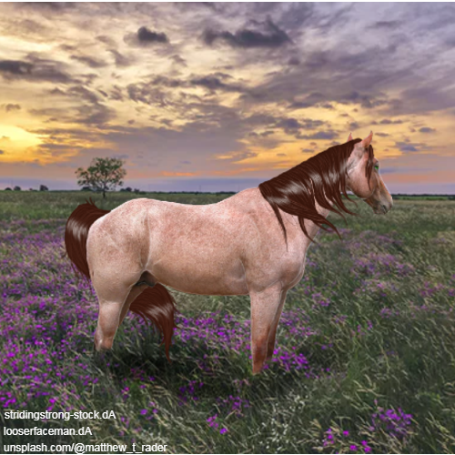
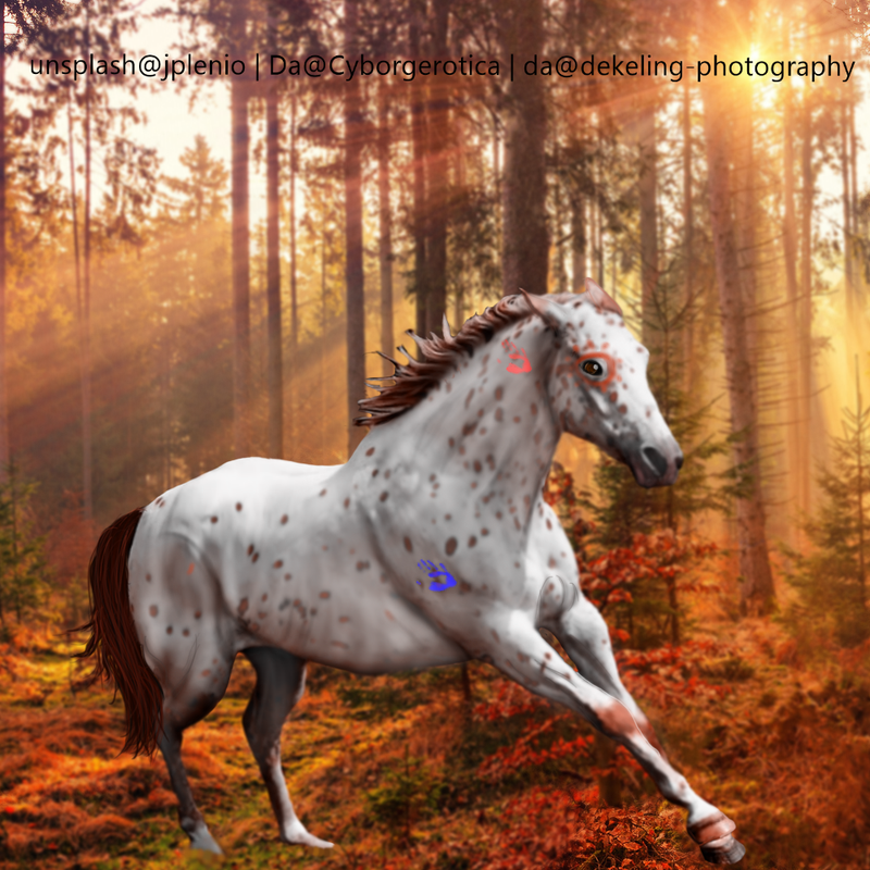
Critique? I struggled with the grounding, any tips with that are appreciated. Blanket appy also looks a bit iffy, otherwise I can't directly pick up what's wrong with this piece :) |
|  |
|
| |

|
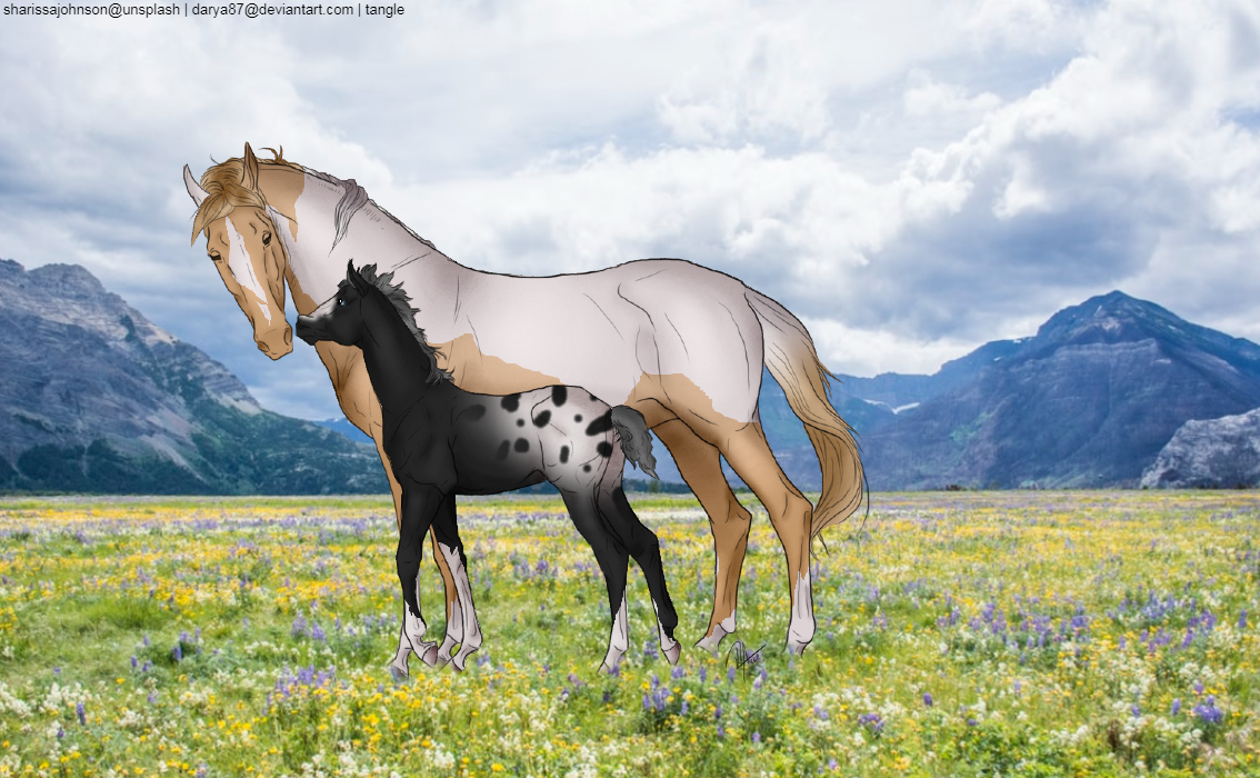
Olive Tree Equine - Tangle - I can see two issues that make the grounding look off in this piece. First, the horses are too large for the background which makes it look 'off' because it's visually disproportionate. Second, the horses don't have shadows which contributes to the floating appearance. This is a decent tutorial for how to make a shadow: https://www.deviantart.com/erraticstudios/art/Shadow-Tutorial-167949661Your coloring and definition look pretty good. In particular, the mare's markings are very well done. |
|  |
|
| |
|
Ah, thanks Merry! Ialways forget the shadow haha. |
| |
|
| |

|
Please don't be too hard on me lol, I'm pretty pleased with this one :3 |
|
|
| |
|
 Just a bit of help please :) Not all the way done mane is still a WIP but yeah. Go to town |
|
|
| |
|
Halp xD First background merge on Ibis - let's just say it was a bit rocky lol. Critique please, I'm also unsure what pose the horse should be + general theme. (Yes I do realize I should have thought of that before I started xD) (clicky it's big) |
| |
|
| |

|
i tried a new style  |
|  |
|
 Morning Drizzle, but Clearing later