| |

|
Winter the horse isn't very defined like it kinda looks like a blob especially around te stomach area. I think it would look cool if you singed the feathers a little bit and they need to be smoothed out a little bit |
|  |
|
| |

Art Team
|
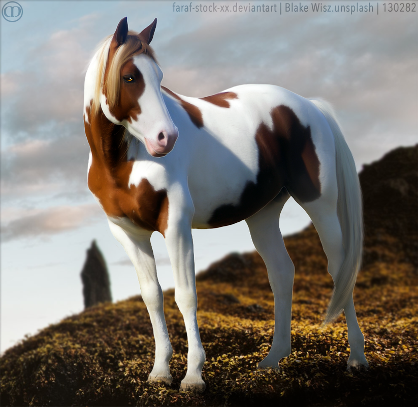
@Wintergreen on the fire pegasus piece I'm going to agree with Cain that the horse is a bit misshapen. I'm not going to say blob but it appears to be extremely obese.... Definitely want to slip up the stomach and reveal more of the horse's left/viewer's right back leg. I really like the contrast the blue eyes provide to the piece. Color is really nicely done. Looking at the underside/chest of the horse, there is almost a greenish tint that transitions to an orange tint from the fire. I would reccomend removing the green and extending the orange/yellow. I'm genuinely not sure what's going on with the horse's left/viewer's eighth front foot. It appears to be very inflamed. Definitely slim that up and try to smooth out the cutting. Judging by the light source, I don't believe there should be a highlight on the viewer's left side of the horse's face. Final suggestion; take a look at the wings. I feel like you didn't actually cut out where the feathers end but rather in a curvy fashion similar to that of the feathers but it doesn't exactly line up, taking away from the neatness of the overall piece. Wings are hard!! They're my least favorite thing to do but when done well, they are absolutely amazing. The mane should probably be rather crazy just by looking the horse's current position. Keep up the beautiful work! P.S. Absolutely amazing job on the paint pegasus piece, probably my favorite from you <3 . @Purp I'd say about 45k <3 |
|  |
|
| |

|
I would very much appreciate some feedback :) Click the image to see it in full size |
|  |
|
| |
Art Team
|
@Merryland Super beautiful piece! Muscling is awesome. Eye is awesome. Body prep is awesome. Grounding is awesome. Lighting is awesome. I just really love the overall effect of this piece. Only part I would reccomend working on is hair. Hair always has some sort of curve or wave to it as opposed to just being straight. That's all I really have for you, keep up the amazing work! |
| |
|
| |

|
Merryland Farm said:
I would very much appreciate some feedback :) Click the image to see it in full size
Love this piece beautiful style, the hair looks great for the piece, I would just add some fly aways. I would work on the lighting, the lighting on the horse doesn't quite match the BG and the BG doesn't have a definative light source, so you are able to create the lighting you want there. check out this awesome tut. to help. |
|
|
| |

|
Commentary and pricing opinions would be very much appreciated. :) |
|
|
| |
|
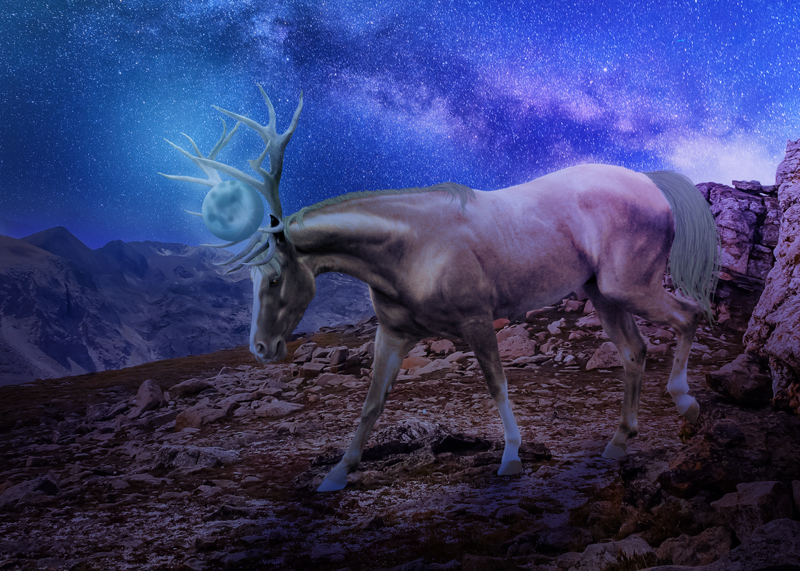
How is this? I know its not a horse but... Ya know. Also, its unfinished. |
|
|
| |

|
obviously still a WIP, but any lighting tips? Trying to do something different than I usually do...but I've been staring at it too long and need some outside opinions :) |
|  |
|
| |

|
Here is another WIP im currently working on. Any tips? I was trying to get a super cool 'glow' effect but it didnt turn out as planned so I kinda gave up on that idea :/ I would love some cretiques/tips! :D |
|
|
| |
Art Team
|
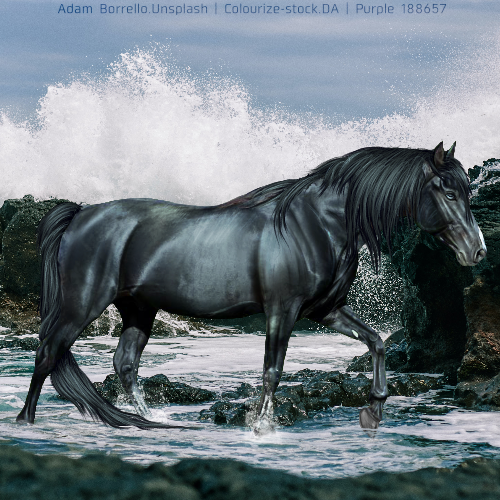
@Purp The body prep and muscling is really really nice. The horse fits well with the background and three of the feet are very well grounded. My issue is with the front, lifted foot. The viewer can see the entire hoof but I think you intended the tip of it to be underwater. I don't think that works in this cause because you can't see any of the other legs or even part of the other legs underwater. So maybe erase the tip of the hoof and give it a little splash. My only other suggestion is to take a look at the hair. To me, it seems somewhat pixelated. I would teccomend trying again with a softer brush. Keep up the awesome work! . @New york Would be happy to critique your piece, horse or not, but the image is not showing up for me.
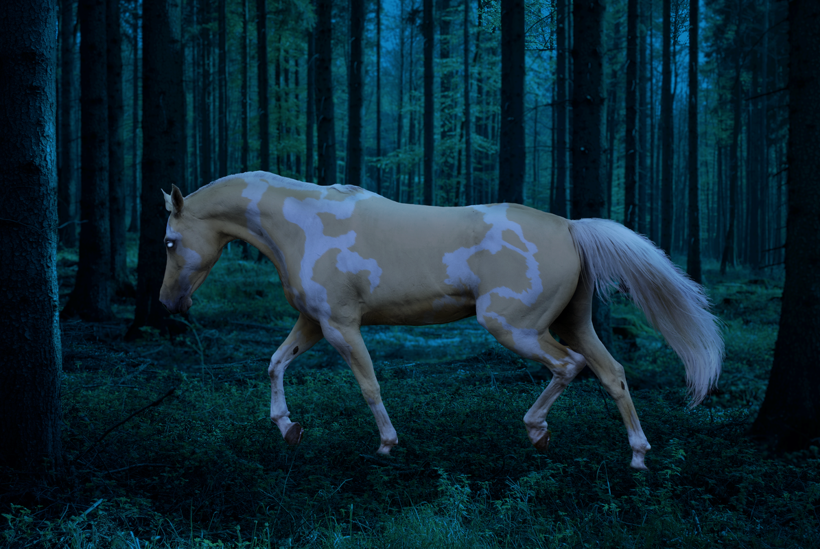
. @Breezie Really can't wait to see the end result on this one, super super cool concept. I think that the highlights on the horse are too strong. Particularly on the face, neck, and shoulders. Then also maybe darken the bottom of the stomach some more. <3 . @Wintergreen Beautiful color change!!! Looks very natural and fits well. Main recommendation I have for you is to look at grounding. The horse's feet just kind of blur out as of now. To add naturalness, draw some strands of grass and foliage over the horse's feet. Very excited to see the result! |
| |
|
 Morning Drizzle, but Clearing later