| |

|
Blitz Farms said:
Diagon Alley Elites said:
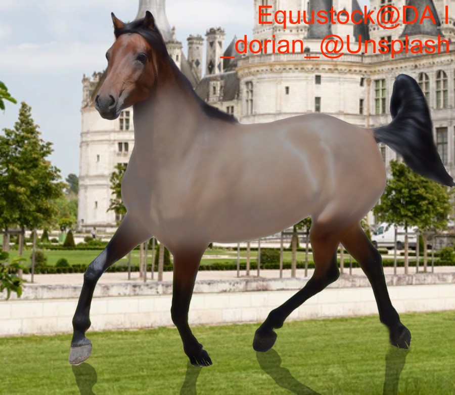
Is this better?
Aww it's pretty! Though I have to comment on the shadows, grass isn't like glass, the shadow isn't quite as clean as that. Also the sun wouldn't be directly on top of the horse like that, I would recommend grabbing a messy brush and scribbling a shadow.
What do you mean by a messy brush lol? Also, is the shadow in the right place or should it be on the far side of the horse or under the horse?
I'm really bad at this kind of thing lmao. |
|
|
| |

Art Team
|
@Diagon Very nice! The light source in the image is most likely the sun which is therefore in the sky. Just looking at the lighting of the rest of the image, the shadow should most likely be less distinct (lower the opacity) and more of a darker blob directly underneath the horse. Grounding wise, take a small brush and draw even more grass strands overlapping the hooves that touch the ground. Is the roan on a different layer then the horse? If no, I would recommend making it so that it is. When yes, set that layer to hard light or soft light then play with the opacity. This will help you to maintain the horse's natural muscling as opposed to slightly losing them.
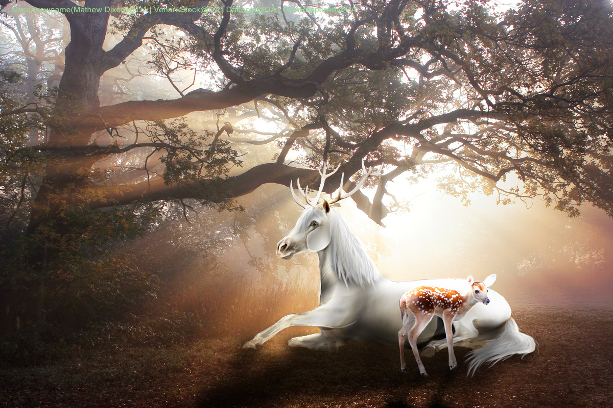
. @Cliffyard Super super cute piece! My main critique for you is to look at lighting. As mentioned by Blitz, the lighting doesn't quite match up the way it is currently. Lower the brightness of the horse and fawn significantly. Then, add a layer set to overlay above the horse and a second overlay layer above the fawn. On these layers, use a soft white brush to highlight where the light is coming from (mainly their backs and the tops of their heads. I genuinely like the grass length currently and I don't see a reason to change that. The horse is nicely grounded with accurate lighting on its stomach and legs. Tail is very nice. My only other reccomendation would be to not use straight white to outline the muscles of the horse's face. At least lower the opacity of the white and Gaussian blue it by 2 pixels.
. @Olive Tree That stock works together really really nicely! The horse is well grounded as well. My main suggestion would be to add a layer set the the blending mode 'color' above the horse. If you can, clip that layer to the horse. Use an airbrush then pull colors out of the sky and paint over the horse. Grab some pinks, oranges, and yellows to realistically tint the horse to its surroundings. My only other suggestion would be to continue the tail. Looking at its current thickness, it kind of just stops when it goes behind the leg. If you can pull it out, that would add a significant element of realism <3 |
|  |
|
| |
|
Thank you for the help guys! Is this better? |
|
|
| |

|
Cliffyard Think about proportion. The horse and fawn are stunning! However, very large for where they sit in the picture. It would look more natural if the fawn and baby were moved forward and centered in the piece. Or, you can crop the image so they are centered which would probably help make them look more proportionate. Your shadows are looking good as well! One recommendation for them is the shadows will be clearer the closer they are to object. The further away the shadow gets, the fuzzier and faded it becomes. This is where a Masking layer comes in handy! Just add a Mask layer above your shadow layer, get your soft Airbrush tool and select the pure black color. Take and fade out those areas closest to the camera. Best way of applying shadows is to duplicate your horse and fawn layer and turn down the brightness to zero. Free Transform them so the shadow is appearing at the angle you'd like (adjustments will need to be made when connecting the shadow to the ground below a planted object, i.g. hooves and legs). It makes the closest shadows crisper and more natural. After that, you can go in with that mask layer! Otherwise, it's a fantastic piece! Keep up the gorgeous work! :D |
|
|
| |
|
Thank you! I'll work on it! |
|
|
| |
|
Anything I can do to this horse image to make it better? I have an art shop but nobody's bought anything yet. I'm afraid it's the quality of my artwork. |
|
|
| |

|
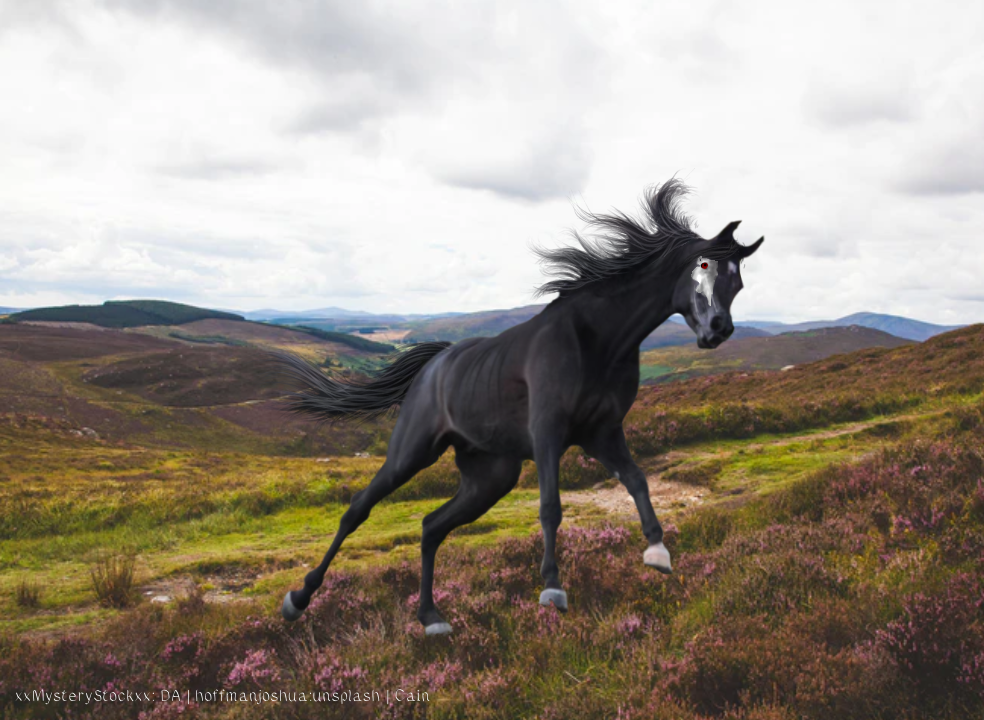
So ya girl tried a new hair style. I think I like it |
|  |
|
| |
|
this is the first piece of art i've done since june/August i think so i'm very rusty lol |
|
|
| |

|
 this is my first manip after a year long break! I really like the way the tail turned out but not quite the mane and forelock. Any pointers are appreciated, I use medibang paint. |
|
|
| |
|
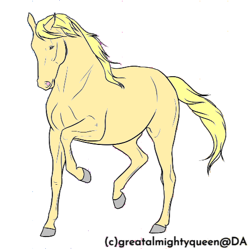
@Twilight This is really nice! Adopts/lineart are hard to do and make good money here on HEE mainly due to the sheer amount of photomanipulations drowning them out. But, it can be done if your pieces become interesting enough! I suggest practicing color matching real life horses to get a feel for base coats and the mixture of the different colored hairs. Go through and begin researching different markings and patterns as well and practice getting more and more complex. The more complex, the mor einteresting the coloring is! I'd also suggest adding your own shadow. This can best be done with an overlay layer with adjusted opacity (to whatever looks best to you) with kind of a neutral grey. Going over it with a darker version of the base coat is best. And don't forget reference! Good luck! <3 @Cain I freaking love that hair! That is gorgeous! And I really, really, love your body prep! @Ladybird This is beautiful! I really love what you did! Next time, it would be easiest to contrast your horse with the background. As it's a yellow background and orange background, a light colored palomino, grey, or white horse would be best and keep from needing the strange glow behind the horse. It is very unnatural as light is coming from above the horse, not behind it. Other than that, I love this! ^^ @Hiatus Ooo! This is so nice! I think the shadows from the back end of the horse get a bit too muddled with the front end of the horse, and making the shadows below it darker would be a bit more natural. Maybe adding a slight tint of green to those shadows would help it blend witht he background better? There should be a hihglight around the horses butt, face and neck from the light behind it. That's all I've got for you! ^^ If you need to know anything else on it, I use Medibang Paint too and I can probably put together some sort of tutorial for specific things. :D <3 |
|
|
 Morning Drizzle, but Clearing later