| |
Trivia Team
|
I had a lot of fun with this, slowly edging back into manips. Would love some insights on how to make the horse stand out a bit more? I feel like most of my manips feel very fade-y and would love to make them pop more. |
|  |
|
| |

|
FirstLightFarms said:
I had a lot of fun with this, slowly edging back into manips. Would love some insights on how to make the horse stand out a bit more? I feel like most of my manips feel very fade-y and would love to make them pop more.
Contrasting colors! Instead of brown in the cave, it could have a cooler light, maybe blueish grey? The red of the lantern would stand out a lot more, and the horse would as well! ^^ The edition of outlines would help as well to make it pop. Where the red of the lantern hits the horse, you could add a brighter red color onto the edges of the horse where the light hits. |
|
|
| |
Trivia Team
|
CC Mustangs said:
FirstLightFarms said:
I had a lot of fun with this, slowly edging back into manips. Would love some insights on how to make the horse stand out a bit more? I feel like most of my manips feel very fade-y and would love to make them pop more.
Contrasting colors! Instead of brown in the cave, it could have a cooler light, maybe blueish grey? The red of the lantern would stand out a lot more, and the horse would as well! ^^ The edition of outlines would help as well to make it pop. Where the red of the lantern hits the horse, you could add a brighter red color onto the edges of the horse where the light hits.
 thanks! I spent two minutes fiddling with it and like it a lot better already. Definitely gonna have to work on contrasting now. |
| |
|
| |
|
FirstLightFarms said:
CC Mustangs said:
FirstLightFarms said:
I had a lot of fun with this, slowly edging back into manips. Would love some insights on how to make the horse stand out a bit more? I feel like most of my manips feel very fade-y and would love to make them pop more.
Contrasting colors! Instead of brown in the cave, it could have a cooler light, maybe blueish grey? The red of the lantern would stand out a lot more, and the horse would as well! ^^ The edition of outlines would help as well to make it pop. Where the red of the lantern hits the horse, you could add a brighter red color onto the edges of the horse where the light hits.
thanks! I spent two minutes fiddling with it and like it a lot better already. Definitely gonna have to work on contrasting now.
Oooh! I love it! ^^ It looks so good! |
|
|
| |

|
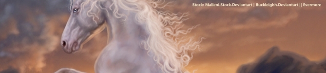
Please click and zoom. Its big so if you don't it'll look pixely and icky lol. I'm really sick of hating my art so I'm hoping to get some help in progressing further. Any critique is much appreciated. |
|
|
| |

|
I love this Mishy! Wish I was there to see you do the hair though Xp |
|
|
| |
|
could u teach me how to do hair like that
Amhain Dull Liath said:
Please click and zoom. Its big so if you don't it'll look pixely and icky lol. I'm really sick of hating my art so I'm hoping to get some help in progressing further. Any critique is much appreciated.
|
|
|
| |

Art Team
|
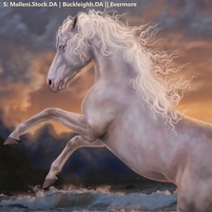
@Mish Make the horse darker then add a color layer above it. Use the color layer to blend the horse with the background by adding colors eyedropped from the sky. I personally would use an airbrush for this. Feel free to mess around with opacities. Beautiful muscling and I love the tail!! |
|  |
|
| |
|
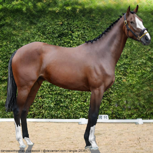
I need help x) Primarily critique on the horse itself, shadow + grounding is still a WIP :) |
|  |
|
| |
Art Team
|
@Tangle I like this a lot! Very realistic except for one thing; feet. The feet and the shadows and the sand do not match up. Specifically looking at the front rear hoof. Love the eye! |
| |
|
 Morning Frost and Afternoon Sunshine