| |

|
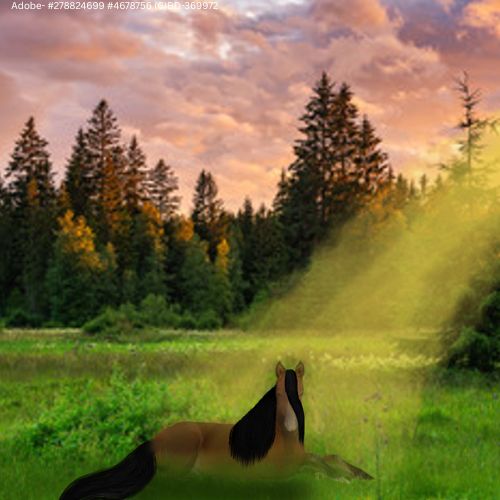
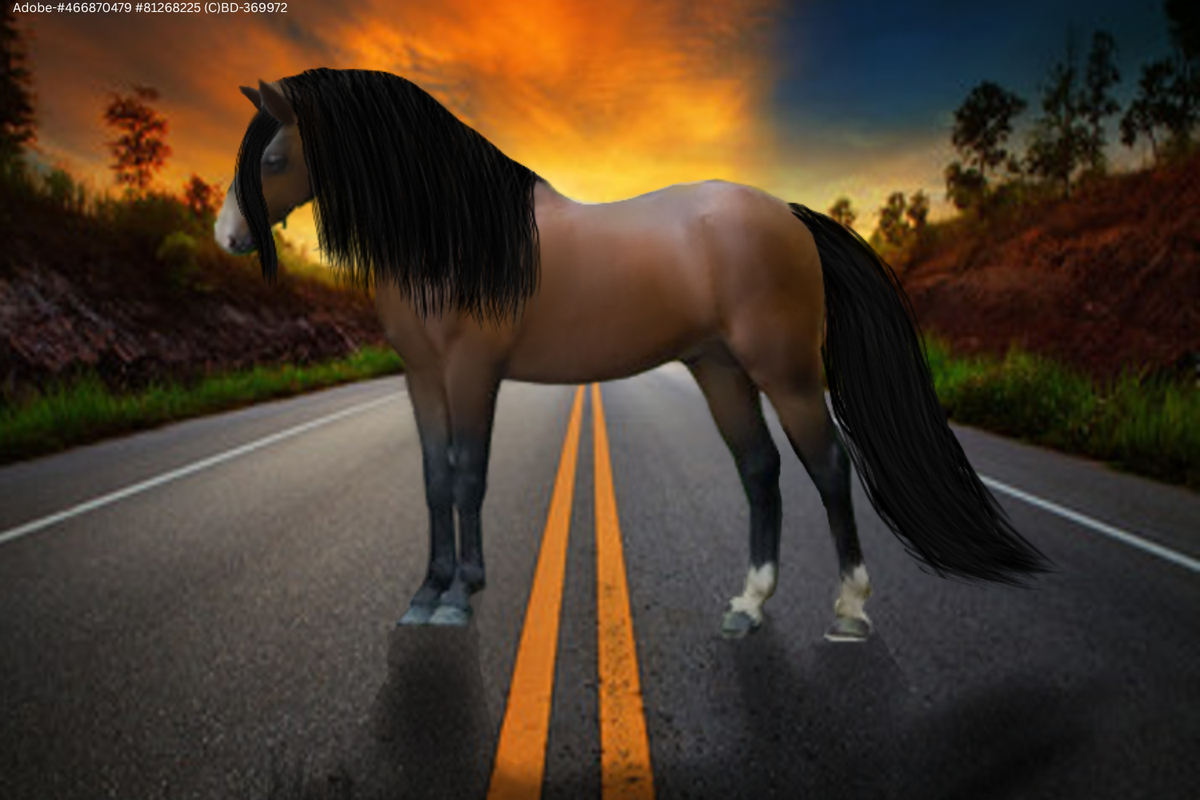
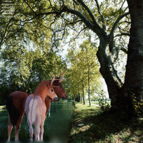
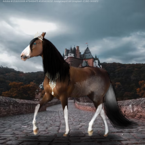
I'm T4, so bear with me. I have recently gotten into the art groove again (With many artists inspiring me and encouraging me throughout HEE <3) and I have begun to increase in quality once more but something is missing. I love how my pieces have ended up looking like recently, but there's always room for improvement and all help is appreciated! <3 <3 |
|  |
|
| |

Art Team
|
Hi!!
May I ask what size of canvas you typically work on? |
|  |
|
| |
|
Gem said:
Hi!!
May I ask what size of canvas you typically work on?
1500x1000 px or 2000x1100 |
| |
|
| |
Art Team
|
Okay cool!
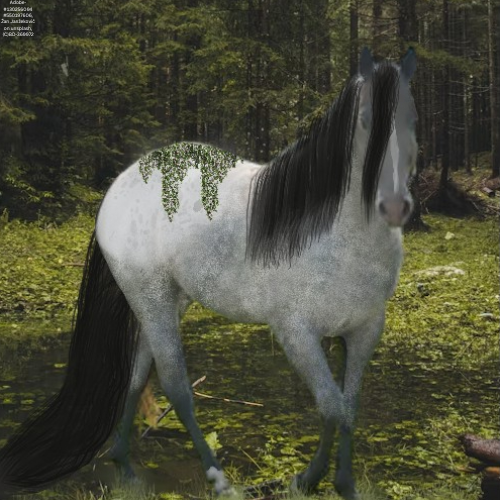
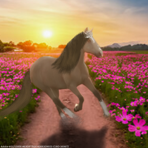
So the biggest thing I'm noticing is that almost all of your images are pretty low quality; as in they're very fuzzy/pixelated which takes away from the overall appeal. This is often caused by working on too small of a canvas but that doesn't seem to be the case here. Instead I guess I'm wondering if there is something going wonky in uploading your images or resizing them or if they look that way while you're working on them too.
. Other than that, I love what you're doing with grounding and you've got an excellent start on color changes and adding patterns!! Once you figure out the quality fuzziness, I think your next focus area should be hair. I like what you've got going on with the flow but it's still very blocky and primarily in one chunk. I would recommend looking up some reference photos of horses or even using the stock photos just to get an idea of how smaller chunks of hair flow and interact with each other. If you're using Ibis, I really like the Force Fade tool so that the hair narrows and fades out rather than being an abrupt end.
. Overall, I really do think you have a great start and I can't wait to see how you progress! <3 |
| |
|
| |
|
Thank you!
Gem said:
Okay cool!
So the biggest thing I'm noticing is that almost all of your images are pretty low quality; as in they're very fuzzy/pixelated which takes away from the overall appeal. This is often caused by working on too small of a canvas but that doesn't seem to be the case here. Instead I guess I'm wondering if there is something going wonky in uploading your images or resizing them or if they look that way while you're working on them too.
. Other than that, I love what you're doing with grounding and you've got an excellent start on color changes and adding patterns!! Once you figure out the quality fuzziness, I think your next focus area should be hair. I like what you've got going on with the flow but it's still very blocky and primarily in one chunk. I would recommend looking up some reference photos of horses or even using the stock photos just to get an idea of how smaller chunks of hair flow and interact with each other. If you're using Ibis, I really like the Force Fade tool so that the hair narrows and fades out rather than being an abrupt end.
. Overall, I really do think you have a great start and I can't wait to see how you progress! <3
|
| |
|
| |
|
|
 Clear with Temps dropping into the Teens