| |

|
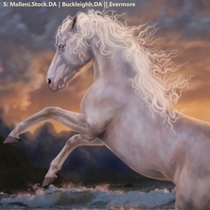
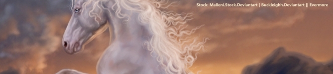
Please help a gal out :") No matter what I try, what guides I follow, nothing works. Some colours are okay but colours like blood bay, copper bay, palomino etc are impossible whenever I try. I use ibisPaint x, if anyone is willing to share some secrets - even through PMs, I would so incredibly greatlful ❤️ |
|  |
|
| |
|
Hii fellow Ibis Paint user here!! My colour changes aren't flawless, but here are a few tips I've picked up over time: - not sure how you do your body prep, but I change the colour of the base image and then manually change the colours of my highlights/shadows to make it fit. there's no one size fits all so sometimes different places on the horse will need a different shade to make it look *right*. I do my prep painting in black and white and then alter the colour afterwards once Ive adjusted the base image, but that's up to you - For white: desaturate entirely, fiddle with the brightness/contrast until it looks normal (I usually have to drop the contrast on the base image to avoid overly white patches) and then go to colour balance. What I do depends on the background, but usually it involves adding a bit of red/pink and yellow - Some colours are just NOT fun to change from, so pick your stock wisely!! I'm not gonna choose a black horse stock image if I need a palomino by the end. Obviously more skilled artists probably can, but I choose life for myself xD - If you're not fully desaturating the image but need it a bit duller, use a saturation clipping layer instead of the saturation drag bar in Adjust. I find that one does weird stuff and desaturates stuff at different levels (ie. there will still be brighter/duller patches) so instead I add a clipping layer, set it to Saturation, paint over with a 0% sat colour, and then play w/ the opacity. - Biggest tip is just. keep on going. There isn't a foolproof approach (from what I've found) since every image is slightly different, but mess around with every tool available from overlay layers to colour balance. Practice doesn't make perfect but it does make better. - If you're not doing a major colour change (e.g. dark bay to palomino) I recommend not 100% desaturating. Personally I find it makes the final colour look a bit flat and uniform, but that's up to you. . I'm quickly typing this in a gap, so feel free to PM me if none of this makes sense!! All of this is coming from a non-repainting perspective, though I'm sure someone like Gem could help you on that front. |
|  |
|
| |
|
Tanglewood said:
Hii fellow Ibis Paint user here!! My colour changes aren't flawless, but here are a few tips I've picked up over time: - not sure how you do your body prep, but I change the colour of the base image and then manually change the colours of my highlights/shadows to make it fit. there's no one size fits all so sometimes different places on the horse will need a different shade to make it look *right*. I do my prep painting in black and white and then alter the colour afterwards once Ive adjusted the base image, but that's up to you - For white: desaturate entirely, fiddle with the brightness/contrast until it looks normal (I usually have to drop the contrast on the base image to avoid overly white patches) and then go to colour balance. What I do depends on the background, but usually it involves adding a bit of red/pink and yellow - Some colours are just NOT fun to change from, so pick your stock wisely!! I'm not gonna choose a black horse stock image if I need a palomino by the end. Obviously more skilled artists probably can, but I choose life for myself xD - If you're not fully desaturating the image but need it a bit duller, use a saturation clipping layer instead of the saturation drag bar in Adjust. I find that one does weird stuff and desaturates stuff at different levels (ie. there will still be brighter/duller patches) so instead I add a clipping layer, set it to Saturation, paint over with a 0% sat colour, and then play w/ the opacity. - Biggest tip is just. keep on going. There isn't a foolproof approach (from what I've found) since every image is slightly different, but mess around with every tool available from overlay layers to colour balance. Practice doesn't make perfect but it does make better. - If you're not doing a major colour change (e.g. dark bay to palomino) I recommend not 100% desaturating. Personally I find it makes the final colour look a bit flat and uniform, but that's up to you. . I'm quickly typing this in a gap, so feel free to PM me if none of this makes sense!! All of this is coming from a non-repainting perspective, though I'm sure someone like Gem could help you on that front.
So sorry, I missed your comment. Thank you for the advice, I will definitely give it a go! Colour changes are a huge area that I struggle in with some colours lol. Thanks again <3 |
| |
|
 Clear with Temps dropping into the Teens

