| |

|
Phantasm Farm said:
Madsie Manor said:
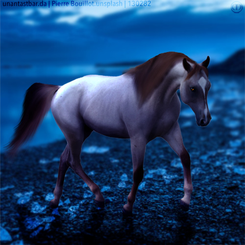
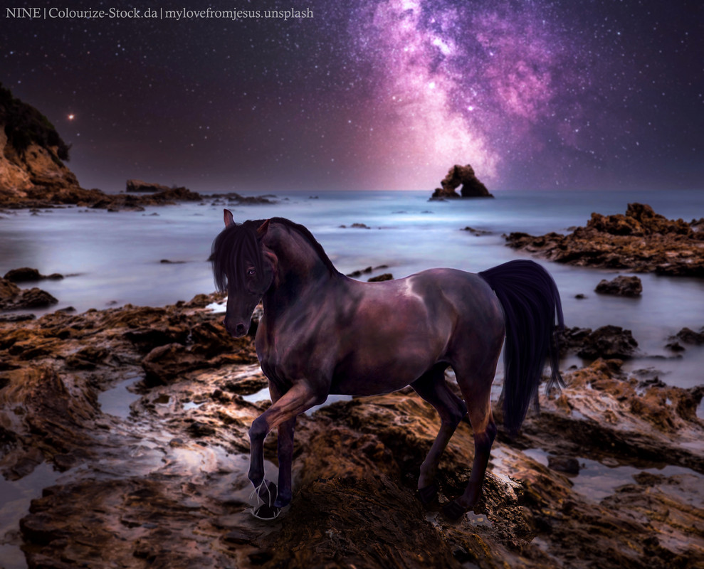
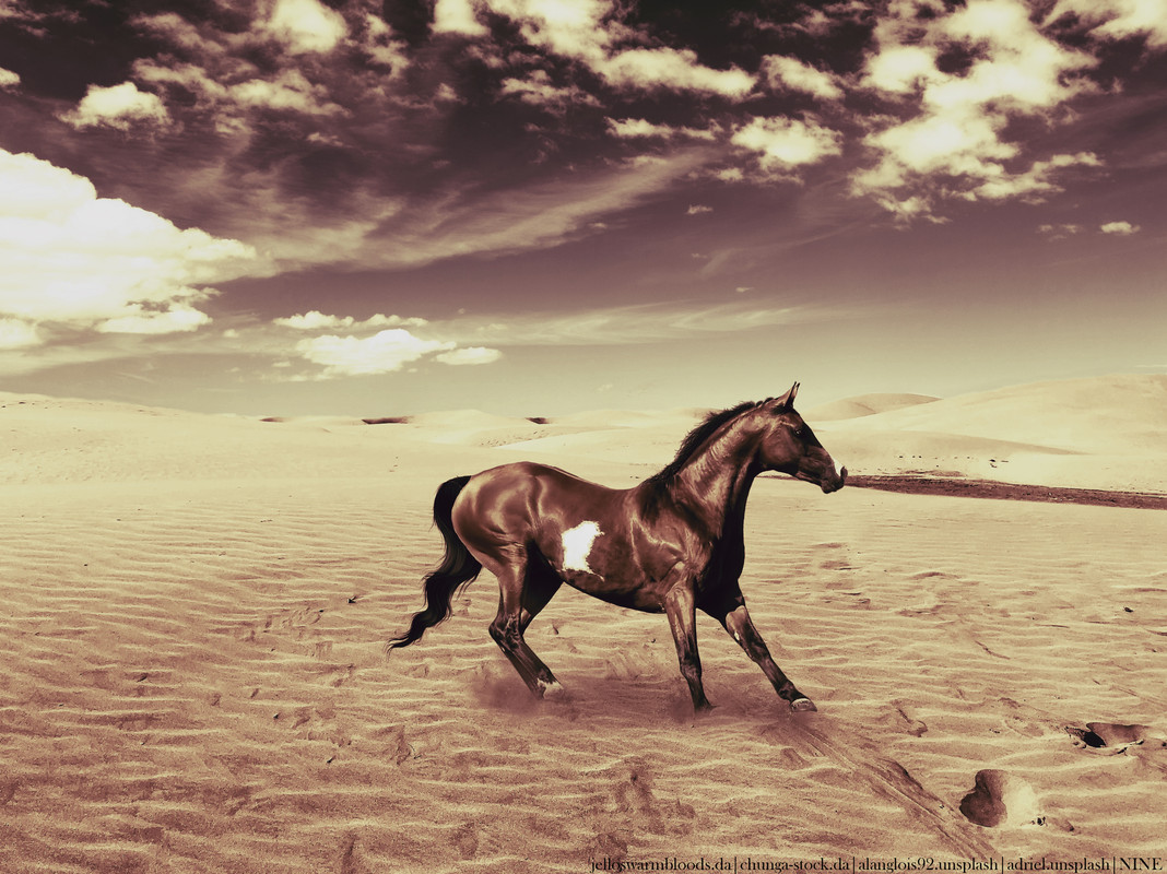
im a tier 3 artist wanting to move into tier 2 soon. I struggle with painting hair and I use pixlr E and photoshop on an ipad.
Hey Madsie, What a great start to your journey you are showing me here. I quite like your artistic vision and am interested to see how you develop it further. There are two main things I would work on before you make the jump up to tier 2; grounding and hair. Your second image is grounded a lot better than the first but still lack shadows. Keeping shadows in mind and your directional light when grounding your horse is important. A horse’s shadow will always be cast in the opposite direction of the main light source. When I do shadows I roughly draw in black where the shadow will lie in the shape of the horse and then blur it moderately and then put the layer on multiply. For lighting on the horse pick highlights and shadows from the background and create a clipping mask and draw on where general highlights and shadows should be. Once these are done guassian blur them so they are soft and set the layer to soft light. For manes work on creating flowing manes and tails. Break it down from tertiary shapes (the whole tail or mane), secondary shapes (clumps) and primary shapes (individual strands or smaller locks of hair. This walkthrough here is a great way to study building up shadows and highlights in manes and tails. https://www.deviantart.com/yewrezz/art/Mane-walkthrough-492961005 In your first image there are a couple of things to watch out for. When cutting out your horse make sure you have no left overs from the background and it is nice and smooth (Like the bay pony). When doing a glowing orb or object with a horse make sure there is bounce light on the horse. That might mean you use a fine hard round light to highlight areas where the light would catch eg. Jawline, chest, top of the legs When grounding your horse make sure the legs are blended in smoothly to the grass or foliage if that’s where the horse is standing. If it’s rock of hard ground you need to always see the leg. On your second image I really like the overall appeal of the image it’s super cute. I feel the lighting works very well. However on further inspection your pony is actually a giant horse as it seems to be standing in a valley of trees. It kinda works but it is quite off putting as there are no other aspects suggesting that this horse is meant to be big though. So keep that in mind for future when picking backgrounds. I do love how you have grounded in the pony though!! I hope this helps Madsie
That's amazingly helpful <3 I thought the trees were flowers lmao 😂 I really struggle with manes and often forget shadows and lighting <3 |
|  |
|
| |

|
Both images are clicky :) 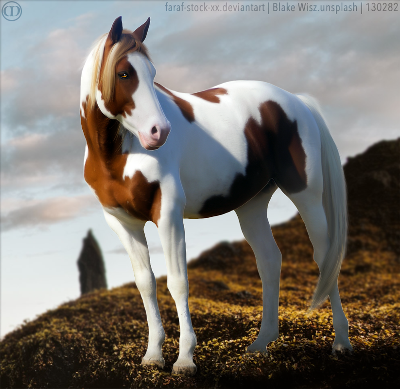 I am currently in tier three but considering moving up to tier two soon. I have been struggling to make my hair look natural while working on a laptop with no pressure sensitivity. The program I use is Photoshop 2021 |
|  |
|
| |

|
Golden Hall Stables said:
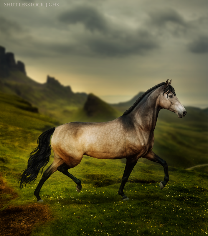
I am in Tier 1 and I use Photoshop. I feel like I am not really consistent accross pieces especially with the manes and tails. I have been trying to improve on my lighting and making the piece feel realistic. The arab piece, I'm not too satisfied with I don't know what is off about it and hopefully you can pinpoint what that was. Thank you so much for doing this!
Hey GHS Your two pieces remind me quite a bit of a Stubbs paintings. He was a well renowned Equine artist painting in the late 1700s. Give him a Google and have a study of his paintings, lighting on the horse, composition and style. If you are aiming for realism in your artworks I would start your search there. Following your recent works you’ve just hit that stage where you’ve levelled up in your art technique and style. However with the lack of experience in this style works are still a bit hit and miss with consistency and follow through. This is a completely normal occurrence to happen and one I have dragged myself through plenty of times in the last 6 years with Photoshop. There is no quick fix in general for this stage, you just have to plug through it and keep doing art. The more you do art wise and push yourself in this the quicker you will find your norm and consistency. However I do have some tips to get you through this stage. The main one is you need to create a style guide for yourself. Format it in word, Photoshop, paper or on a chalkboard as long as you can read it and understand it that is what matters. On your style guide you need to include what you like or are aiming to achieve. If you just believe you drew the best tail of your life screenshot it, crop it and paste that in your style guide. Did you just see an image that has amazing lighting, screenshot it, crop it and stick it in your style guide. You then have this style guide open and ready to look at when your arting. That way if you ever get stuck or unsure you have reference right there on hand on what to do. It’s like an artistic map. Your lighting in both pieces is very nice and well executed. It’s not actually your lighting that is letting you down but your composition particularly in your Arab piece. There is really no diagonal lines of view in play and the positioning of both horses are unbalanced as an artwork. This is what you were saying about the artwork being off. The human eye is drawn to horizontal lines and the rule of thirds. Positioning your horses so they play into it will make a good image great and a great image exceptional. Keeping this factor in mind when picking stock and choosing backgrounds will give you a head start. Here is a link talking about the rule of thirds. It’s got great explanations and examples. https://mymodernmet.com/rule-of-thirds-definition/ In your buckskin piece I really love the colour palette you choose. I’m a sucker for soft muted tones and you really delivered on that. Personally I would scale/ position the horse so that it’s head is silhouettes against the sky. It gets slightly lost as the head is quite dark compared to the rest of the body and is semi backed by the mountain. I really love the movement in the tail but personally believe there should be more highlights. Flyaways in the mane and forelock will help add that extra movement. In your bay Arab piece I looovve the colour balance you have created with a rich deep red and vibrant greens. Apart from the balance thing I was talking about earlier the horse is quite small which is another factor which makes the image sit not quite right. Making the horse bigger again so the head was silhouetted against the sky would be something to consider if you wanted to retweak it again. I love your mane and tail but the tail seems to have too much white highlights. I do prefer this tail over the buckskin tail shading wise. Another thing to quickly interject before I forget is to make sure the shadows at the base of the horse are consistent with the shadows around it. This means that you have the horses shadow the same depth and colour as that shadow near the clump of grass. This is extreme nit picking though. GHS I am in love with your horse prep and its some of the best I’ve seen in a long time. You have put a big amount of time and consideration into it highlighting subtle details and it has definitely paid off. Hats off to you. Hopefully this has helped. I’m happy to talk through anything further GHS. |
|
|
| |

|
I think I can speak in the name of many artists when I say I appreciate your help and in depth responses a LOT! So a huge thank you, and I hope you get better soon :D 

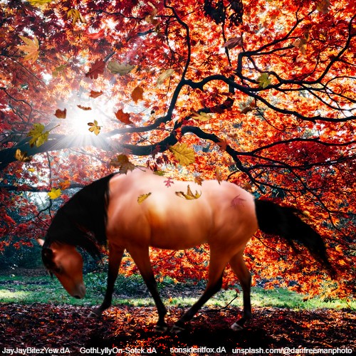
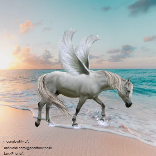
I'm in tier 1, I use Photoshop. These are my most recents but one of them definitely not my proudest. In the first piece I didn't really struggle with anything, it all came together just as I wanted it to. The second one, however...
I struggled with merging the background. When blurring the edges of the bushes from the waterfall, a small white line appeared around it that I couldn't get rid of for the life of me. So I ended up blurring much less than I initially wanted to. I had some issues with the horse stock image being low quality on the hind legs, and overall I don't feel that this piece gives back my art style whe it comes to body prep at all. This was also my first time using precut wings, and I decided to never do it again, because the quality was so low I almost gave up on it xD |
|  |
|
| |

|
hey! i appreciate your help so much ♥ so i use Pixlr, and i am currently in tier 3. i would like some feedback on these pieces, please thanks for all the help! |
|
|
| |

|
Hi bell, thank you for this opportunity!! These are my only two works since starting with adobe PS I'm SO proud of the mane in the first one, its my best one yet (in all my years of on and off arting lol) I currently don't have a tier and I'd love your input on that since id like to open a shop. Im thinking really low end tier 2 or higher end tier 3 I think lighting and manes and tails are my main weakness I have really been working hard on my body prep but i would LOVE more advice on that I'm a super hands on learner so I would really appriciate tutorials. I use the latest version of adobe PS Thanks so much!!! <3 |
|
|
 Sunny and Warmer