| |

|
Palette Tricks; West's Edition Before reading this please, please read Cali's guide, this gives a basic understanding of palettes. (click) This guide helps you enhance your palettes. ⚡︎ 1. Palette Etiquette 2. Color Combos 3. Choosing Backgrounds 4. Keeping Backgrounds in Place ⚡︎ Please don't comment yet. |
|
|
| |
|
1. Palette Etiquette Every palette maker has had a code they want badly. So they search, and they search. And then they search some more. After lots of research and click bait ads, they found/or made the code that they badly wanted. If someone tells you the code to something, and you go and tell someone else and they make a forum post on it. That's on you. You should not ever share codes unless the peron who gave it to you has permission or gives permission. Its just respect. I have codes I cannot share because the owner/person who found it doesn't wish for it to be shared. |
|
|
| |
|
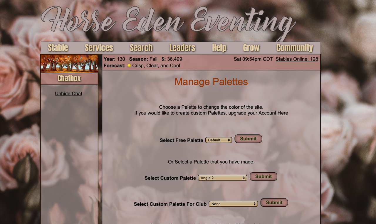
2. Color Combos Now, we all love a good neon yellow but not so much so that we are blinded. There is a balance. For me I found my niche. I love aesthetic palettes. I like doing muted yellows, or pink/gray palettes. When you are learning, its natural to go straight for the bright yellow and the blue. At this point you are here because you want better palettes. Here's how I went from palette's like this: To this: ⚡︎ Now obviously, there are some codes there that made it look better. Some of those codes I cannot share. ⚡︎ Here is what I do: 1. Find a quality background from unsplash. 2. Use a color selector from (click) 3. Select 2-3 main colors 4. Use the same tone colors 5. Match, page to quest and chatbox etc. ⚡︎ What are "same tone" colors? This: D6A695 -BAD5DC- 87887 They all have the same, vibe, per say. You can go vibrant just moderate. The easier on the eyes, the better. |
|
|
| |
|
3. Choosing Backgrounds Backgrounds are THE palette. If your background is gross. Nobodys gonna want it. The key to a good palette is the placement of the background. Let's say you found a nice background. You put it on and the animal in the middle is hidden and all you can see are blurred leaves. That image just doesn't work. The hardest part for palettes, (for me) is finding the background. ⚡︎ Ok. So you found a background you like. This is it: Ok, Ok that's nice but on a palette the flower disappears. So instead, do this: Even though there is a person in the image, with a solid palette page, it won't show up. You'll only see the flowers and not just really blurred leaves. That said, having a blurred background isn't bad. |
|
|
| |
|
4. Keeping backgrounds in place Someone did give me a code for this but I found it because of So basically, the background can scroll, stay fixed, or repeat. I liked the fixed code best. That said when looking for backgrounds, look for shorter images because the bottom half of long images gets cut off. Here is the code: body{
background: #D0E4F5 url(https://images.unsplash.com/photo-1534710961216-75c88202f43e?ixlib=rb-1.2.1&ixid=eyJhcHBfaWQiOjEyMDd9&auto=format&fit=crop&w=1000&q=80) no-repeat fixed 0px 0px;
} |
|
|
 Sunny
Sunny