| |

|
Snowmass Horses said:
What would you pay for this, as I cant figure out a steady price for my art, and critiques?
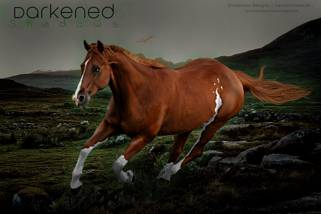
What caught my attention was body prep or rather lack thereof. The horse still has most of the texture from the original image but in some places, such as the hip, it's smoother. Smooth is more the look most artists aim for. Also; the mane/forelock. To me, these don't match. The forelock is long, flowy, while the mane is short and chopped. For me that takes away from the realism of the piece. Very nice job with the markings and the tail. I personally would pay 70-80k for this piece.
Barkers Run said:
Gem said:
@Barkers Run I think this piece looks great! Very nice job with the lighting. The mark on the shoulder isn't actually what slightly bothers me about this. What caught my attention was actually the right front leg. It seems fuzzy, for lack of better word. It's hard to tell the edge of the leg from the ground behind the leg. 40-55k
i see what you mean haha, but thats how the original image was, there was a bit hoof but i removed it as his stepping over the top, if that makes sense, but thank you heaps! :) will take it into consideration for my next one
You are very welcome! Glad I could help 😊 |
|  |
|
| |

Rumble Team |
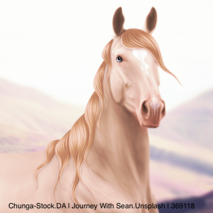
I rarely post here, but now I need validation xD To me it feels that the tail is alright but the mane ruins the piece. Is it as bad as it feels for me?  |
|  |
|
| |

Moderator |
First of all this absolutely gorgeous HRS, I love the colors together. Now for the mane it's not bad it's really good actually but I feel like whats getting you is the fact it just kind of looks stiff, like it doesn't look like its flowing with the horse, that piece between the shoulder and neck should be falling down as well as the hair along the outside of the neck instead of out. Nothing really drastic needs to change it just needs to droop a little |
|  |
|
| |
Rumble Team |
Thank you! I was following the mane of the stock horse but I guess I shouldn't have. Now that you point it out it really does look weird :,D
Spirtasi Whims said:
First of all this absolutely gorgeous HRS, I love the colors together. Now for the mane it's not bad it's really good actually but I feel like whats getting you is the fact it just kind of looks stiff, like it doesn't look like its flowing with the horse, that piece between the shoulder and neck should be falling down as well as the hair along the outside of the neck instead of out. Nothing really drastic needs to change it just needs to droop a little
|
| |
|
| |

|
Holy crap HRS that's drop dead gorgeous *^* I need like 12 XD |
|
|
| |
Rumble Team |
Yay thank you :3 Not sure if I could produce 12 identical images though...
Breezie Rose said:
Holy crap HRS that's drop dead gorgeous *^* I need like 12 XD
|
| |
|
| |
 |
My half of a collab... a 12 limbed horse(8 legs ,4 wings) the others are doing bg ,hair,lighting ect |
|
|
| |

|
How is this one looking so far? I need help with how i should flow the tail if that makes sense? |
|
|
| |
|
Snowmass Horses said:
How is this one looking so far? I need help with how i should flow the tail if that makes sense?
I like it! I'm thinking you could maybe have a raised tail, like that of an Arab? Or possibly one that curls around the hind legs. |
|
|
| |
|
This looks great so far! I would suggest looking back at the original stock image and pull your tail inspiration from there if you can. It's always helped me! |
|
|
 Partly Cloudy, Rain Possible