| |

|
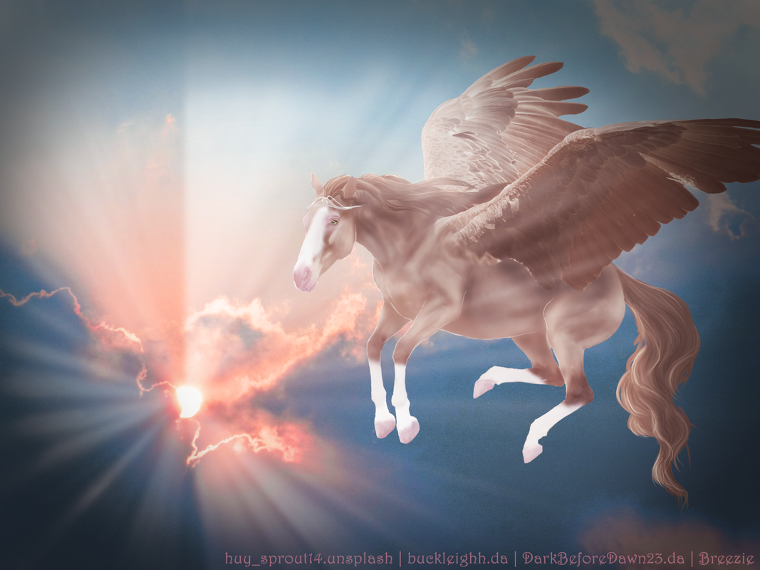
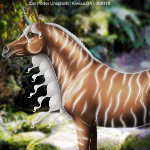
I've been on the struggle bus today, so I know it's not my best quality. Even so, it needs critiquing please :) First time in a while that I've done a pegi Edited at June 15, 2020 09:20 PM by Breezie Rose |
|
|
| |

|
I genuinely love this piece. Absolutely breathtaking. That tail and the crown are beautiful. The mane, to me, wasn't quite up to the same standards as the tail though. It looks very limp and less shiny. Secondly; lighting. There isn't really a dark part of the horse when their should be shadows on its rear end based on looking at the background. I so want this.... |
|  |
|
| |
|
Help please >.< 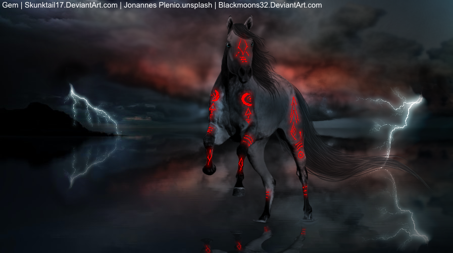 |
| |
|
| |

Moderator |
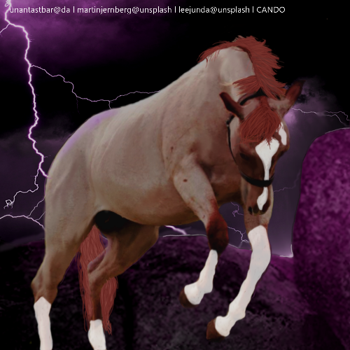
That is a really cool piece like I'm genuinely liking this! For the red markings I would suggest maybe making them match the lighting of the horse so have the face and front leg markings about as dark as those parts are same with the back right leg. Hope that helps! I really do like this piece |
|  |
|
| |
|
Thank you! I don't love it but I'm glad someone else likes it <3 the markings themselves are meant to be glowing so I can work on that :) |
| |
|
| |
Moderator |
Oh the would suggest maybe a filter like overlay! |
| |
|
| |

|
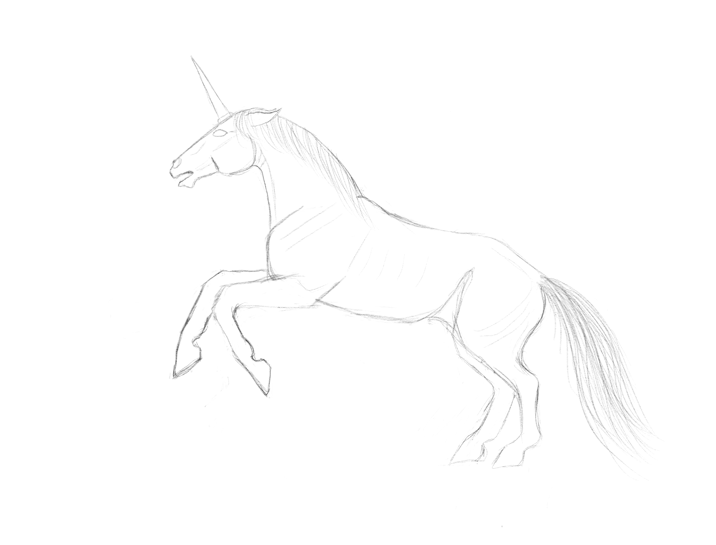
I feel like I have an issue with the proportions, like the forlegs are too large or hind legs too small. Maybe both. Can't decide. Thoughts? Thanks. Edit: sorry, the lines show up alot paler on the computer than they do on my tablet. Edited at June 16, 2020 12:12 AM by Ryshadium RIDs |
|
|
| |
 |
For proper proposes , make the neck just a bit longer, the head bigger The front legs also need to be shorter, I suggest splitting the legs into two parts, excluding the hooves,as make each section as long as the head I hope this helps :) |
|
|
| |
|
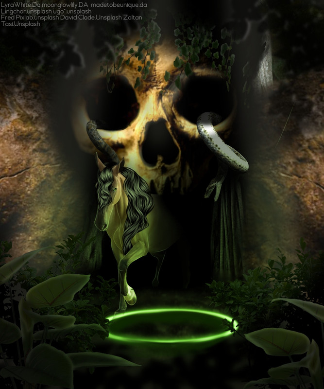
I would like any and all critique in this , a detailed and picky as you can get it. Because raven has been thinking about moving to tier 1,what do y'all think? Edited at June 16, 2020 02:55 AM by Ladybird Estate |
|
|
| |
|
 Thoughts on how i can improve? |
|
|
 Snow and Sleet Mix, Clearing at Night