| |

|
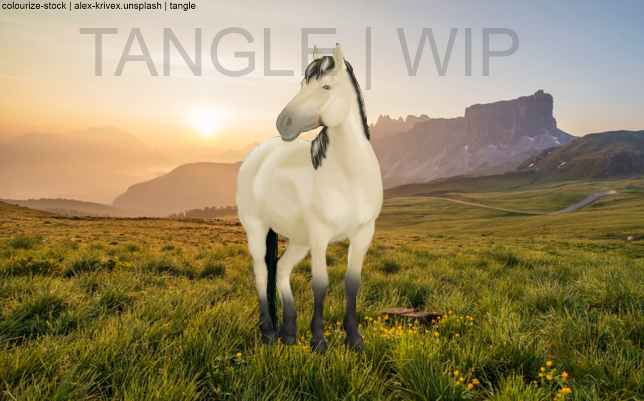
How can I make the mane better? It's my first time, and my program's brushes all come out pixelly : |
|
|
| |
|
Silver Galaxy Ranch said:
Pricing Help & Critique p.s. lineart ain't as easy as it looks
As a fellow line-artist, I get what you mean. But there are some things you can do to make it better: 1. Clean up the edges. The mane and tail have quite a lot of stuff outside of the lines, which take away from the pretty shading. After finishing, always go around the entire horse to erase the outside, to give it a more professional finish. 2. Shade! I love your mane + tail, beautiful job with highlights and lowlights. However, everything else is a flat colour. I personally like using the Burn and Dodge tools to shade, darkening where natural shadows would form and vice versa. Then go over with the blur brush, but be careful not to blur everything. 3. Small details. Ties in with the above. As a lover of those tiny details that make a piece just pop, the eyes and hooves were slightly flat for me. Try shading them (as described above) and adding a shadow below the horse. I really don't mean to come across as harsh <3 I love the mane and tail, and the cute pink nose. Good job! |
|
|
| |

|
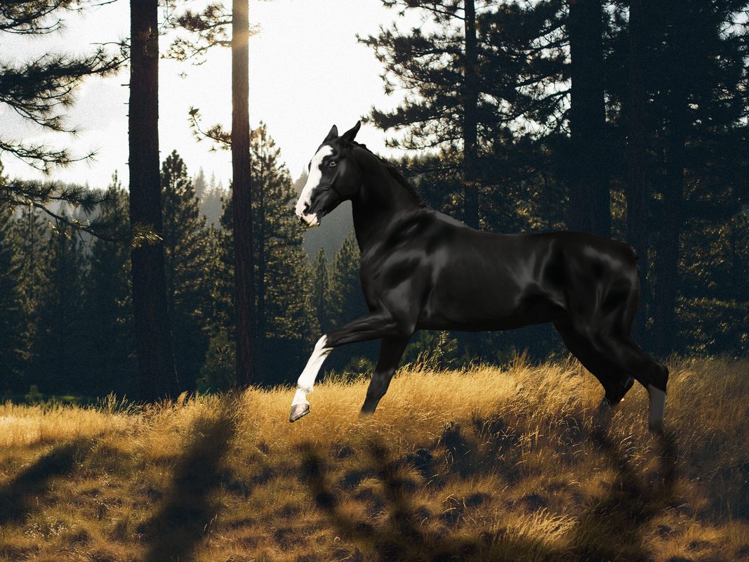
Is the mane where it should be? I'm struggling a little bit XD |
|  |
|
| |

|
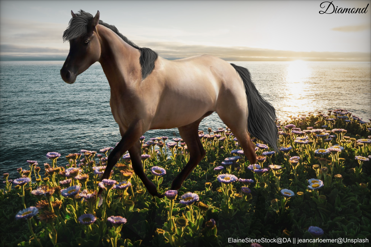
After some playing around i found something I like. I would love to know what I can improve for next time 🙂 |
|
|
| |

|
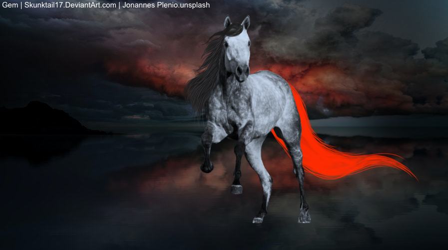
Gem said:
Is the mane where it should be? I'm struggling a little bit XD
The mane and tail are both caught in the wind (or so it appears) but wind only blows in one direction, so they should be blowing the same way :) |
|  |
|
| |
|
Thanks! Is this any better? |
| |
|
| |

Moderator |
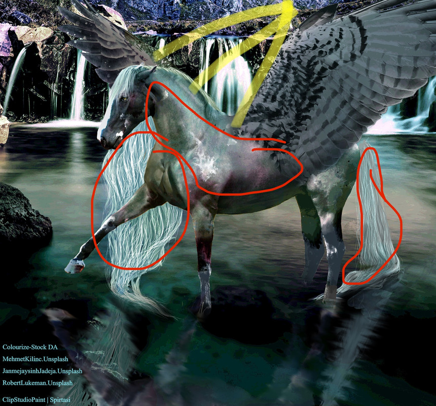
I've been working on this on and off for the past three days and it just doesn't look right, please rip it to shreds! |
|  |
|
| |
|
My biggest recmmomendation for you, Wings, is to take a look at lighting. By looking at the background image, to me, it seems Luke the light source is where Inhighlughted in yellow. The front wing is well lighted to that. The horse, not so my co. The areas circled in red are much lighter than they should be having the highlighted area as the light source. More lighting; also take a look at the highlights on the back wing. Aside from lighting, you could try blurring the background a bit to bring more attention to the horse. I very much like the iridescence to the horse and the mane. Keep up the great work! |
| |
|
| |

|
This is a WIP. I haven't done hair yet frankly because I'm not sure what I'm going for yet lmao and I haven't started lighting yet either. Please tear my body prep/repainting apart! I also tried a new eye technique :D |
|
|
| |

|
Breezie, everything but one little bit looks great. I looks like something's coming out of the horse's butt. |
|
|
 Bright Sunshine with a few High Clouds