| |

Moderator |
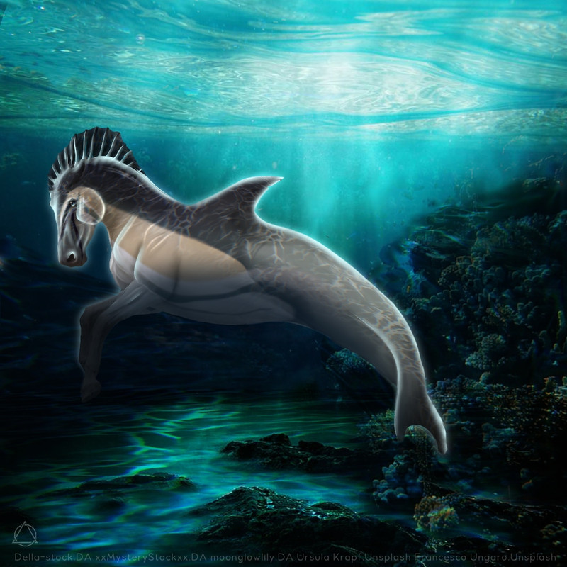
What are your thoughts, and I would love some critiques It's a horse fairy thing in an amber! It was such a weird piece to do! |
|  |
|
| |

|
Spirtasi Whims said:
Gosh markhor that is absolutely stunning the only thing I would say to do is maybe add some little stray hairs? Something like that might make the mane and tail not seem like it was just placed on, but other than that it is do beautiful and good job making the mane and tail look good
Thank you! I will definitely do this! |
|
|
| |
 |
Please click :) This was my first time trying to paint armor aaaand... it's okay?? lol I have no clue what I'm doing. But overall, I'm pretty happy with how this piece turned out. Critique? |
|
|
| |

|
*clutches ebs* Do not tempt me to get more art |
|
|
| |
|
I'm super proud of this But RIP it to pieces :) |
|
|
| |

|
Amhain Dull Liath said:
Please click :) This was my first time trying to paint armor aaaand... it's okay?? lol I have no clue what I'm doing. But overall, I'm pretty happy with how this piece turned out. Critique?
with painting armor i would start out with a new layer with grey or dark brown depending on if its gold or silver and just layer the next color on like for gold it would be a lighter brown then a yellowish brown and then a light yellow/tan for some highlights and make sure you put a dark shadow underneath it and lower the opacity so it looks like it sits on top of the horse and isnt a part of the horse on the edges do a light highlight to show that its an edge then you can do color balance to make them fit in with the color scheme:) i would say your body prep is very nice but make sure you darken the parts that would be away from the light it will add more of an effect of drama to the piece for example in between the legs and the front of the chest/neck area and for eyes i would start with a darker base so they dont look as put there. The hooves are a bit plain so i would ad some lines to make them more realistic and maybe color balance them a little so they dont look as grey. i love this piece i think the color scheme is very beautiful and i love the markings on this horse i especially love what youve done with the tail and how it fades into brown. but for this specific piece i think the horse just needs to be a bit darker in some places:) very good job |
|  |
|
| |
|
Ladybird Estate said:
I'm super proud of this But RIP it to pieces :)
THIS IS SO BAD ------->jk jk im joking but its really good the eyes are so realistic and have a very good depth to them but the highlighting on the body is very bright and could use a tone down or set to overlay the way the body blocks that front leg from the light means it probably shouldnt have highlight on it though maybe give the horse a bit more of a blue/green tint to it but not too much just a dab it looks really pretty i love it |
| |
|
| |

|
Kinda feeling stuck at this point. Not really sure where to go from here. All I've done is body prep and color balance. Never had this many light sources to work with XD Any help is greatly appreciated :D |
|
|
| |

|
@Breezie My recommendation would be to lower the brightness of the horse so that it's as dark as it would be in this settings without any light sources. From there, use 'Overlay' layers to take it one light source at a time. Good luck! <3 |
|  |
|
| |
|
|
 Daytime Flurries, Clearing Overnight