| |

|
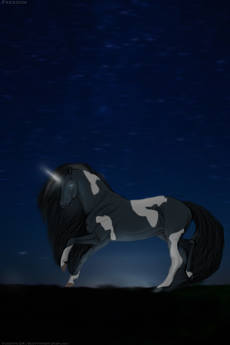
Looking for some suggestions before I submit it to the contest <3 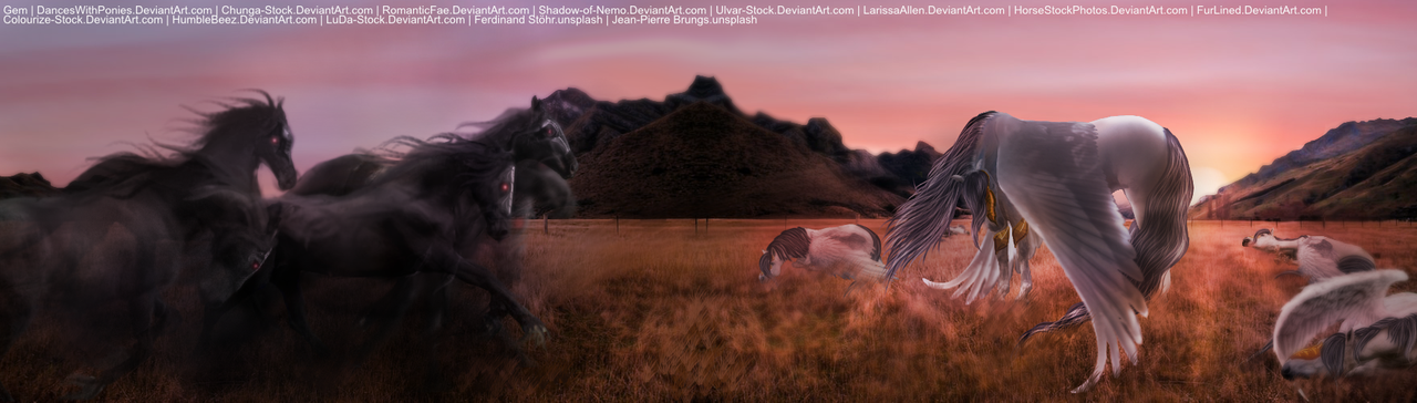 Please click to view differently. |
|  |
|
| |

Moderator |
Critiques? Things I did right? I'm trying to improve It is a very large image so please click here to hopefully see all the details |
|  |
|
| |

|
Freedom Elites said:
Critiques?
Love this! I like how you made the light source clear and distinct, as well as highlighting and lowlighting different places. Things I think you could work on: ~ Lighten the area around the horn slightly, since it glows. ~ Make the patterns a little less smooshy; first try outlining where you want the markings to go with a small brush, and then fill it in with a larger one. ~ More shading on the actual horse. You've executed the lighting well, but you still need to shade the natural shadows of the horse, giving it a rounder effect. ~ Hooves. It looks as if you simply coloured them in, instead of taking the time to shade them as well. Try darking where the touch the ground, and lightening up the closest part to the light source. (I like using the Retouch brushes for this, it simply makes sure that it is the same shade only darker.) ~ Shade the eyes. I love that star glow, but again. Darken and lighten various parts of the iris, same as above. I really love this! Sorry about the stack of tips, this is what happens when I don't do this for a while xD |
|
|
| |

|
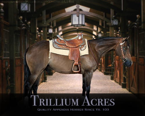 Hey guys ;) It is quite rare that I do art nowadays due to school + my own job, but today I sat down and worked up myfelf a stable bio! Any critiques? It looks quite simple however I spent about 8 hours on this today >.< So many layers lol. It ended up being my absolute favorite though! |
|
|
| |
|
Spirtasi Acres said:
Critiques? Things I did right? I'm trying to improve It is a very large image so please click here to hopefully see all the details
I absolutely love this piece. The lighting...the wings....the sand... it all fits together absolutely perfectly!!! My recommendation for you would be to take a look at body prep of the horse. Currently, the highlights on the horse are from the original photo and they aren't exactly where they would be if this science were real. The mane and tail are absolutely gorgeous though. The individual strands are placed very nicely...... might I ask how I can get my hands on this piece? XD <3 |
| |
|
| |
Moderator |
Aw gee thanks Gem! Will certainly try to fix the highlights. Currently I have no plans on selling this but you can PM for art inquiries if you are interested |
| |
|
| |
Moderator |
Trillium that is absolutely gorgeous! I don't really have any critiques cause I'm still learning and I don't want to give bad advice!
Trillium Acres said:
Hey guys ;) It is quite rare that I do art nowadays due to school + my own job, but today I sat down and worked up myfelf a stable bio! Any critiques? It looks quite simple however I spent about 8 hours on this today >.< So many layers lol. It ended up being my absolute favorite though!
|
| |
|
| |
|
Trillium Acres said:
Hey guys ;) It is quite rare that I do art nowadays due to school + my own job, but today I sat down and worked up myfelf a stable bio! Any critiques? It looks quite simple however I spent about 8 hours on this today >.< So many layers lol. It ended up being my absolute favorite though!
The lighting looks very nice. The simplicity makes the piece even prettier. My recommendation would be to see if you can try to define the face more. Make it a little less 'fuzzy' for lack of better word. I would also recommend drawing an eye for the horse to give it a little bit of personality. The tail is very nicely done as well <3 |
| |
|
| |
|
Gem said:
The lighting looks very nice. The simplicity makes the piece even prettier. My recommendation would be to see if you can try to define the face more. Make it a little less 'fuzzy' for lack of better word. I would also recommend drawing an eye for the horse to give it a little bit of personality. The tail is very nicely done as well <3
Thank you <3 I will try this tomorrow. I appreciate the help! |
|
|
| |
|
|
 Daytime Flurries, Clearing Overnight