| |

|
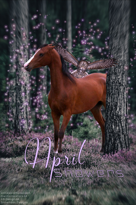
Looking for a critique for this piece. :) |
|
|
| |

|
Put a few sparkles on front of the horse just so it doesn't look like they're hovering behind her. Second; the owl. The layering and depth does not line up and that caught my attention immediately. The horse is completely behind the tree so the owl physically can't be behind the horse and in front of the tree at the same time. Also, try using a different brush to blur the edges of the image rather than a zooming blur just because the horse is stationary. |
|  |
|
| |

|
Thanks, Sunset!<3 I know I definitely need to work on my lighting techniques XD Maybe I'll try to throw a practice piece together tonight to see if I can make more improvements. Does anyone else have any tips on how I can improve overall? It's a big goal of mine to make it to Tier 1 at some point :D Oh! I tried a new thing the other day! I tried braided hair for the first time!  How does it look for a first attempt? (I know the face detail isn't great, this was mainly just for hair practice) |
|
|
| |
|
That braid is gorgeous!!! My recommendation would be to keep the shadow down the middle more consistent when you transfer from the silver mane to purple <3 |
| |
|
| |

|
This is the first piece I've down in months, I know it isn't great, but I'm still starting out! Any critique is helpful |
|  |
|
| |

|
Heaven on Earth said:
This is the first piece I've down in months, I know it isn't great, but I'm still starting out! Any critique is helpful
i know im not a professional but id say place the horse in a bit of a different place in scenarios like this just because the horse can end up not being the center focus and they can just look a bit too big i love your cut out job its great and your body prep is a very nice style try adding a bit more of eye work to make it look more put together and alive and id say your manes and tails look very straight so try to add more curve to them and fly away hairs sometimes its helpful to draw under the hair where it should be over the horse's body with black and guassian blur it to make it look like its actually over the body:D the horse seems to blend very well in the background as far as color scheme goes but dont forget to add a shadow under even if its not directly in sunlight and add more shadow under the feet for grounding very nice job though its gorgeous!! |
|  |
|
| |
|
Would love some critique please <3 My part of an art trade :) |
| |
|
| |

|
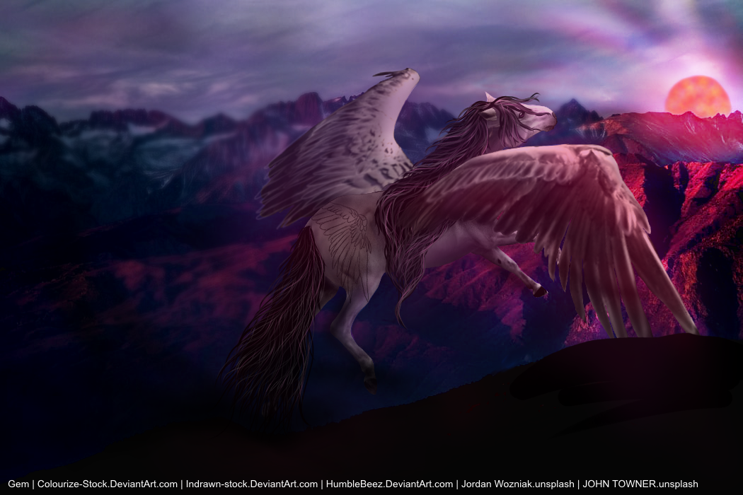
Long time no see everyone;) Went a bit MIA for a while. Oh my, Gem! That looks lovely! A few critiques though. 1) When the wings hit the darkness, you could make the cut a little less harsh. 2) The hooves need more shading and to be less of a solid color. 3) The wing oh the flank of the horse should have more detail and look less "drawn on." Try to make it more realistic! 4) Lastly, the backgroud near the sun is slightly too sharp. It takes the veiwers attention away from the horse. Try slightly blurring it or gently use a soften tool. Maybe make the horse's wings a bit sharper too. Hope this helps! <3 |
|
|
| |
|
|
| |

|
Oh trillium could you update my role to T1 instead of tier 2 please <3 |
|
|
 Overcast and Calm