| |

|
If work. On grounding and lighting And working on making face markings look a bit more natural, the image at the top of the page has a pink muzzle and it looks very unnatural Try using a desaturated pink and blue it a bit |
|
|
| |
 |
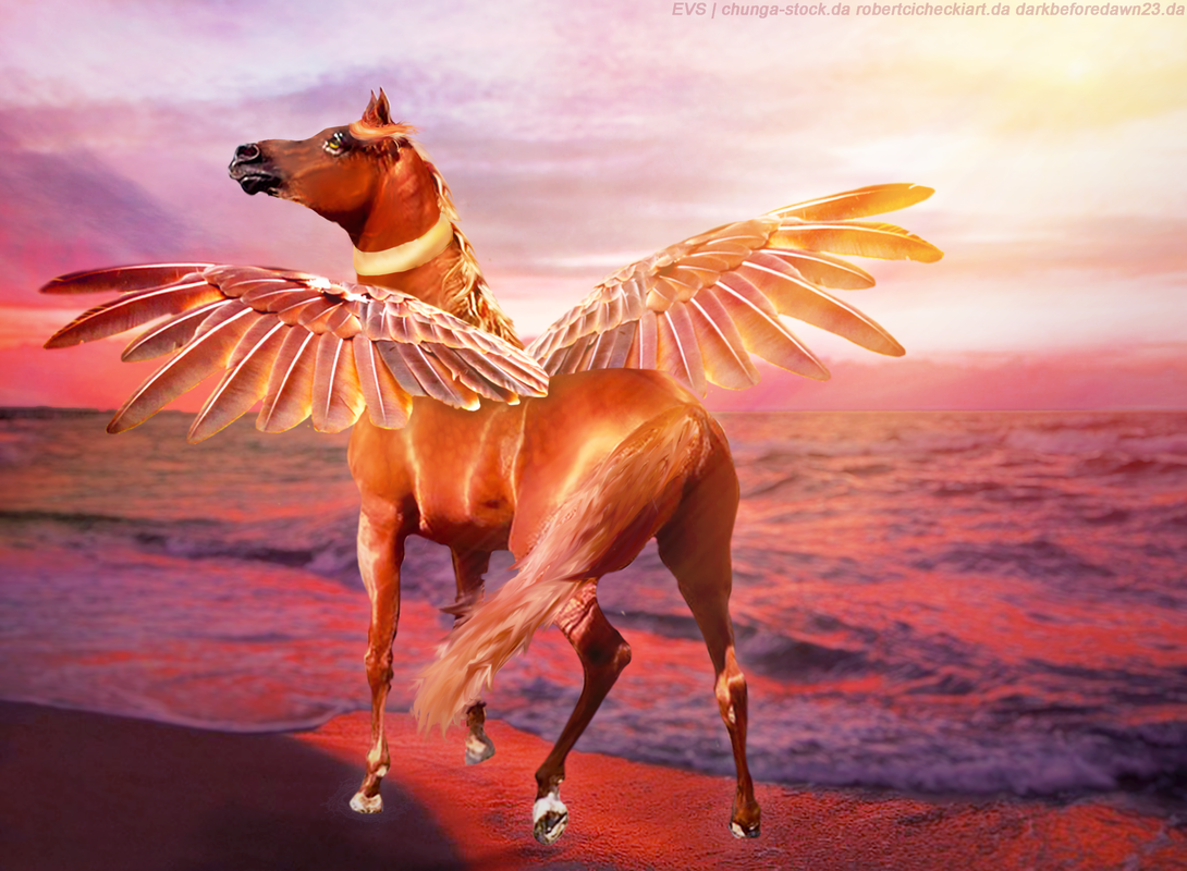
Hi! I made something!!
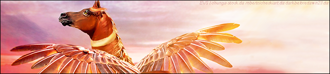
I need some heavy critique as I know my art is not what it used to be, but I am still pretty happy with the outcome of this. I am considering using it as a club set for my art club or auctioning it off. If I were to auction it off, does anyone know what SB/AB could be? My art sold around 90k for all cuts (which this is, I have already made all cuts) in my prime. Ty! (By the way, this image is very large, around 3000px+) Full image - Banner - Those are my two favorite cuts, chip away on improvements :D |
|
|
| |

|
Everflame Stables said:
Hi! I made something!!
I need some heavy critique as I know my art is not what it used to be, but I am still pretty happy with the outcome of this. I am considering using it as a club set for my art club or auctioning it off. If I were to auction it off, does anyone know what SB/AB could be? My art sold around 90k for all cuts (which this is, I have already made all cuts) in my prime. Ty! (By the way, this image is very large, around 3000px+) Full image - Banner - Those are my two favorite cuts, chip away on improvements :D
I'm not the best at critiques, and don't do this often but I'll give it a go lol First of all, the piece is really nice! I like the over all idea! But the main thing that I think you should focus on is your smudging technique. To me at least the horse looks a little over-smudged in places and under-smudged in others, and while either could definitely be part of your style or process, it is best to keep it consistent so that the piece doesn't look to messy. If you look at places like on the hind leg above and below the tail you should be able to see what im talking about. I'm not sure what program you use (if you use gimp feel free to pm me and I can offer in-depth help), but my main advice would be to duplicate the horse layer and smudge on that at a low rate, so that you can lower the opacity of the layer if needed. Another few things that you could add would be a shadow, which could really help to ground the horse, and show shadows around the gold on the neck to help make that look like it belongs. (I may edit later with some tips on the hair/pricing) |
|
|
| |

|
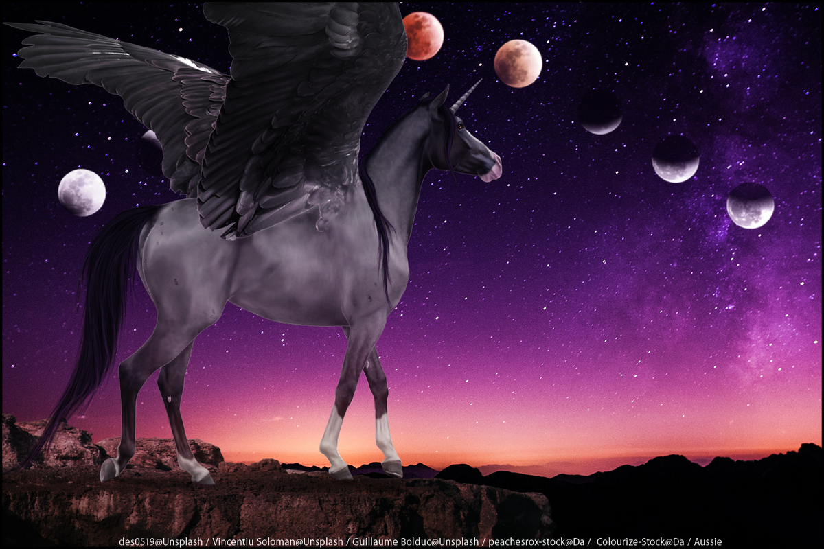
id like a critique on this piece please:) |
|  |
|
| |

|
@Everflame
I love the way you started off that post 😂 1. First off, make the wings bigger. One wing alone should be able to cover up most of the horse. I love the color of the wings though. 2. Take a look at your lighting. To me, it seems like your light source is coming from the right side of the image. I noticed that you do have shadows matching that on the wing but the horse's lighting doesn't quite work with the background. Definitely add some more shadows there. One more thing about shadows (😆), your pegasus should also have a shadow!
3. The feet draw a lot of the viewer's attention. Why? Because they're quite bright in relation to the rest of the image. Shadows are definitely going to be your friend. 4. The tail needs work. Giving drawing it a shot. Make sure to use a palette so you can keep the colors consistent between the mane and tail <3 Think small strands of many shades. . Auctioning I'd say maybe 35k SB and 220k AB. Overall, I adore the colors of this piece along with the feeling of serenity. |
|  |
|
| |
|
Wings can I just first of all say that.. The peice is frickin gorgeous! So much so there's not much so I can critique on -on the legs and where the hooves are there shouldn't be mugh light, try working on lighting a lil bit by there with some shadows :) -the hair is simply stunning and has a great flow! -try blurring the bg a bit, my attention was drawn to the bg quite quickly, even a slight lns blur would be great |
|
|
| |
|
@Wings My recommendation is to first identify your light source. I also find myself wanting to see more of the details on the face especially the eye. You could try lightening it up or even just adding more highlights <3 Gorgeous mane!!! |
| |
|
| |
|
More recent/most recent could i get another critique on this one:D |
| |
|
| |

|
After some thoughts on this piece. It was my 4th (I think) time using photoshop so there's obviously still some things I need to improve. |
|
|
| |
|
Aussie Wattles said:
After some thoughts on this piece. It was my 4th (I think) time using photoshop so there's obviously still some things I need to improve.
Similar to what I told Everflame, lol; bigger wings more shadows. More shadows particularly on the feet and the back wing. The white spot on the back wing really caught my attention. |
| |
|
 Clear with Temps dropping into the Teens