| |

|
https://i.ibb.co/sCVtSv6/Untitled484-1.jpg
I'd appreciate some in depth, nitpicking crituque on this please |
|
|
| |

|
Sunset Grove Farm said:
https://i.ibb.co/sCVtSv6/Untitled484-1.jpg
I'd appreciate some in depth, nitpicking crituque on this please
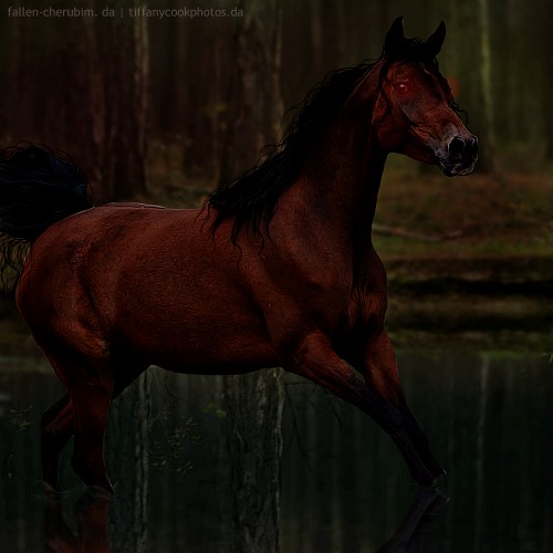
To me, the cheekbone right under the eye is a lil sharp and maybe too highlighted? Also, the feathers aren't as detailed as they maybe could or should be? I LOVE the hair and the eye. Maybe add some of the pink to the forelock as if the eye was a light source? If I may ask, how'd you do the tail? I love it! |
|
|
| |

|
Sunset Grove Farm said:
https://i.ibb.co/sCVtSv6/Untitled484-1.jpg
I'd appreciate some in depth, nitpicking crituque on this please
Great work overall.
First thing I notice is the horses cheek. It's extremely sharp and just doesn't look right - no horse has that sharp of a cheekbone lol. Try softening it a bit. There seems to be a lack of highlights in the horses mane and tail which make it look like a big blue lump. The edges of the wings look really choppy and rough in a few places, make sure to have smooth consistency when cutting them out. I'd try to bring just a tad more of a purple hue into the horse to flow with the background better. The horse seems overly smudged and lacks muscle definition, especially in the face. I understand some people enjoy the smudged look and it's part of your style, but it seems overboard. Try toning that down just a tad and adding more highlights and lowlights, especially to the face, for that muscle definition :) |
|  |
|
| |
|
Amera Eventing said:
Sunset Grove Farm said:
https://i.ibb.co/sCVtSv6/Untitled484-1.jpg
I'd appreciate some in depth, nitpicking crituque on this please
Great work overall.
First thing I notice is the horses cheek. It's extremely sharp and just doesn't look right - no horse has that sharp of a cheekbone lol. Try softening it a bit. There seems to be a lack of highlights in the horses mane and tail which make it look like a big blue lump. The edges of the wings look really choppy and rough in a few places, make sure to have smooth consistency when cutting them out. I'd try to bring just a tad more of a purple hue into the horse to flow with the background better. The horse seems overly smudged and lacks muscle definition, especially in the face. I understand some people enjoy the smudged look and it's part of your style, but it seems overboard. Try toning that down just a tad and adding more highlights and lowlights, especially to the face, for that muscle definition :)
Breezie Rose said:
Sunset Grove Farm said:
https://i.ibb.co/sCVtSv6/Untitled484-1.jpg
I'd appreciate some in depth, nitpicking crituque on this please
To me, the cheekbone right under the eye is a lil sharp and maybe too highlighted? Also, the feathers aren't as detailed as they maybe could or should be? I LOVE the hair and the eye. Maybe add some of the pink to the forelock as if the eye was a light source?If I may ask, how'd you do the tail? I love it!
Thank you both I'll see what I can do ^^ I did the cheekbone like that as it was based of a horse prep tutorial, I'll try and alter it now ^^ |
|
|
| |
|
https://i.ibb.co/q5CPw14/Untitled484-2.jpg Does this look better? I redid the hair |
|
|
| |
 |
|
| |
|
Oh god all the posts are messed up |
|
|
| |
|
Opinions on this piece?
I have been working on a new style and I'm enjoying it more 😊 |
|
|
| |

|
Kirralee said:
Opinions on this piece?
I have been working on a new style and I'm enjoying it more 😊
I like it, although I think that the bright lines around the horse are a bit too thick, maybe make them a small bit thinner, maybe the actual neck is a bit too thin, it might not look as thin with a mane, other than that I can't see anything wrong with it :) |
|
|
| |
|
Lazy Duck Elites said:
Critique? :D
This looks awsome ari! Try adding some lowlights and highlights to the hair, it looks just like a block of colour and doesn't have any definition Everything else looks great to me |
|
|
 Crisp, Clear, and Cool